Dated: 30-10-2021
Client: Al Muzaini Exchange
Duration: 6 months
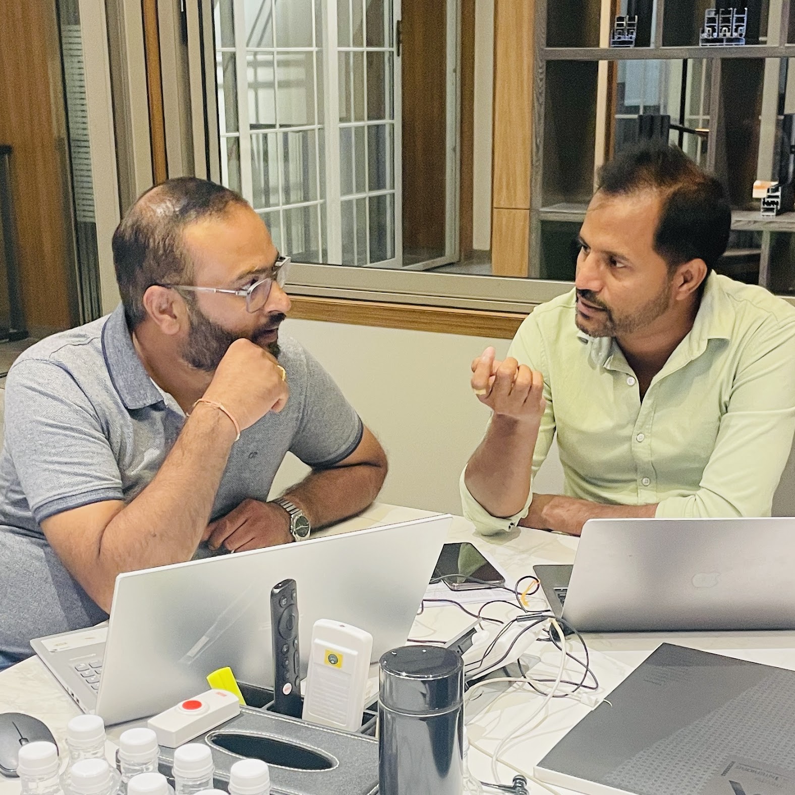
Team size: 2 members
THE PROBLEM STATEMENT
As a leading global money remittance exchange company renowned for its extensive network of agent locations and cross-border money transfer services, we are currently facing a significant risk of losing our competitive edge in the digital marketplace. Despite our strong presence in traditional money transfer channels, our lack of an online presence and mobile application has left us vulnerable to competitors who are effectively leveraging digital platforms to capture market share and meet the evolving needs of our customers.
Company’s absence from the digital space means we are missing out on the growing segment of tech-savvy customers who prefer the convenience of online and mobile transactions. This gap not only limits our ability to attract new customers but also risks alienating our existing customer base who are increasingly seeking more accessible and efficient ways to conduct financial transactions.
To address this challenge, we must develop a comprehensive digital strategy that includes launching a user-friendly online platform and mobile application. These digital solutions should seamlessly integrate with our existing systems, enhance the customer experience, and enable us to compete effectively in the rapidly evolving financial technology landscape. This strategic shift is crucial for maintaining our market leadership and ensuring sustainable growth in the digital age.
My Observations
COVID-19 pandemic: exchange houses and currency exchange services have experienced temporary closures or disruptions in their operations.
Fast-growing competition: People prefer faster, eariser and more convenient alternatives.
Outdated user experience: The old and domestic only Al Muzaini app was too limited to be scalable or upgraded, and even perceived as obsolete by younger generation of users.
THE GOAL
To offer competitive mobile money transfer product in both domestic and international markets, as a pillar of building an omni channel service, by designing the app from scratch to allow easy, quick and reliable money transfer:
It needs to provide improved and intuitive UX along with modern and thoughtful UI.
It needs to be scalable for localization and international deployment.
It needs to leverage the advantage of massive agent locations for bridging the gap between online payment and offline cash pickup.
THE PROPOSAL
The proposed app will be designed with a deep understanding of user needs and behaviors, prioritizing a seamless and intuitive user experience. Key features will include easy account management, secure and real-time cross-border transactions, multi-currency support, and multiple payment options—all wrapped in a clean, user-friendly interface. We will focus on building a design system that ensures consistency, accessibility, and adaptability across different devices and touch points.
By embracing a mobile-first design approach and incorporating advanced UX/UI principles, we can create a compelling digital product that not only meets the current market demands but also aligns with future growth. This platform will empower users with a convenient, efficient, and secure way to manage their finances globally, ultimately enhancing customer satisfaction and loyalty, and positioning company as a digital leader in the remittance industry.
PROJECT METADATA
My Role (Beyond pushing pixels)
Conducted research to understand user needs, behaviours, and preferences through interviews, surveys, and usability testing.
Structured the information within the product to enhance usability and accessibility.
Created visual representations (wireframes and prototypes) of the user interface to demonstrate the layout, functionality, and flow of the product.
Designed click-through prototypes to showcase how users interact with the product, including defining user flows, creating interactive elements, and ensuring a seamless and intuitive experience.
Conducted usability tests to gather user feedback and identify areas of improvement for the product’s usability.
Tools (Designing & Prototyping): Figma
Frontend Development:
Managed frontend development deliverables by ensuring the frontend code adhere to the design and accessibility guidelines, making the product usable by people with disabilities.
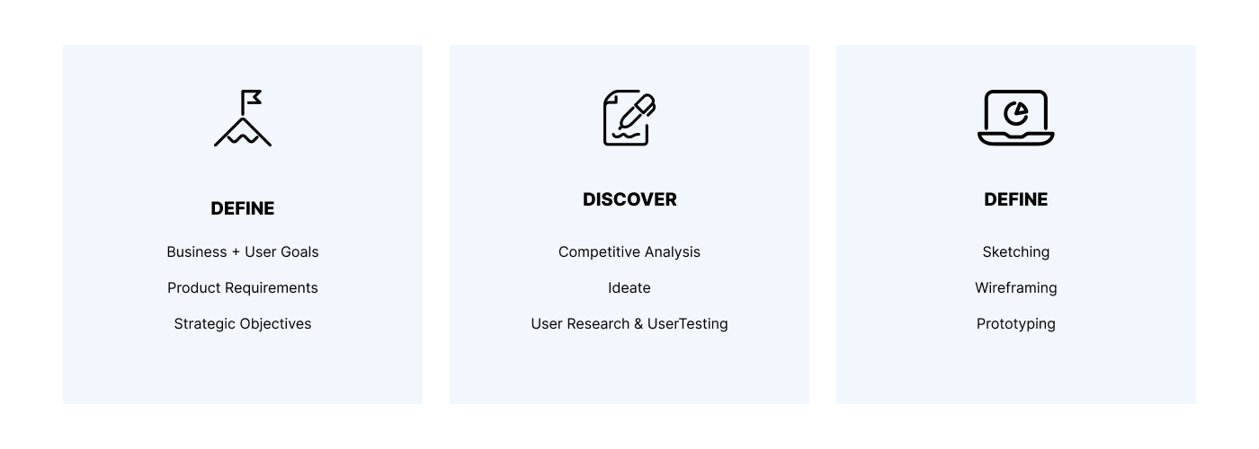
ITERATIVE DESIGN PROCESS
Understand why/why not people choose Al Muzaini and how they use the existing products/services to send money.
Customers don’t want to always wait in lines and fill out paper forms. Ultimately, they just need to send money. Although Al Muzaini locations are broadly accessible everywhere, tapping on the screen is simply preferred by mobile users.
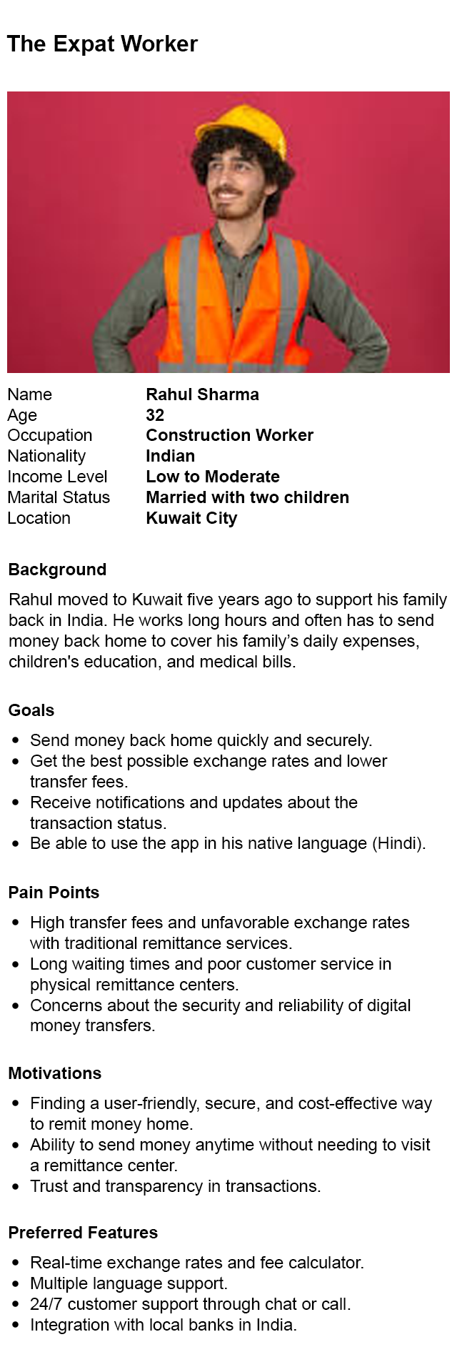
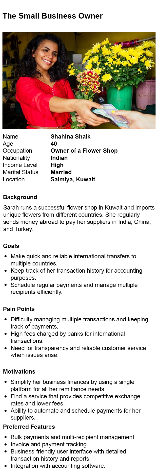
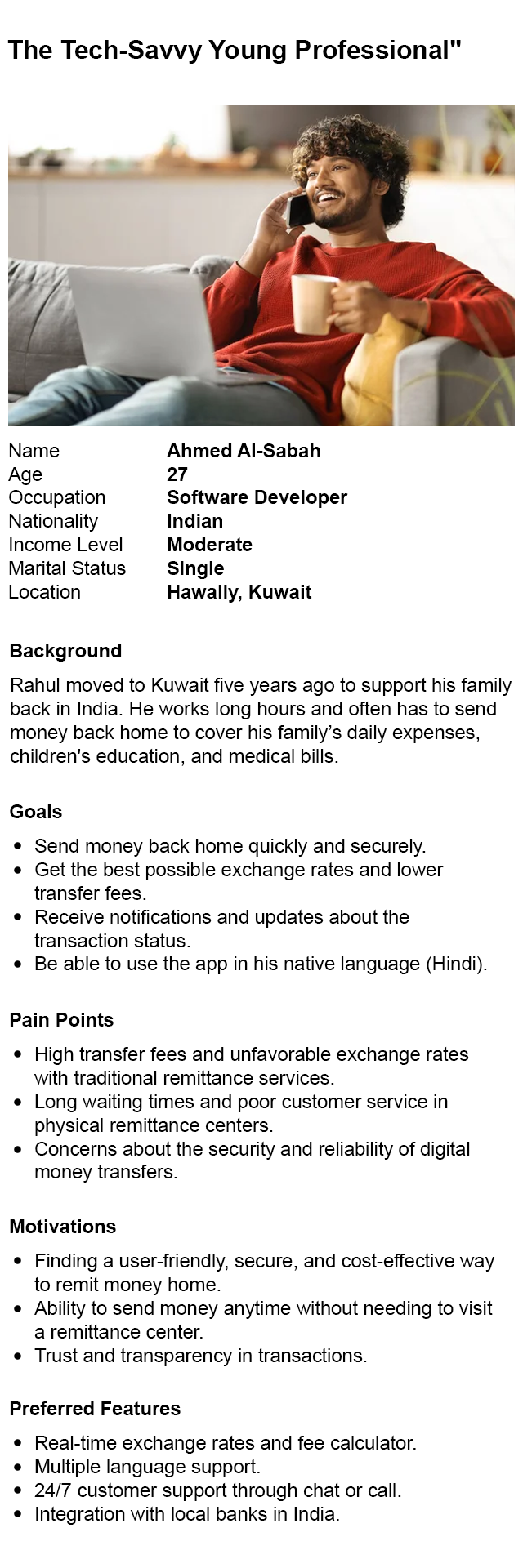
TARGET AUDIENCE
The personas identified through user research reveal customers from three perspectives:
The lapsed
who perceive Al Muzaini as the old-fashioned money transfer service, and they have embraced digital alternatives like PayPal.
The current
Both loyal customers who have been actively using Al Muzaini services, and
those who are passively involved in the money transfer process.
The future
People who recognize the brand and would consider fulfilling their money transfer
needs with Al Muzaini when the time comes.

Live up to the needs, exceed the expectations
The new app needs to be visually modern, process-wise familiar, feature wise capable, yet specialities clear to win the hearts of target customers.
COMPETITIVE ANALYSIS
Step-by-step onboarding and in-app help resources for a smooth user journey.
Easy navigation with prominent call-to-actions for key functions like sending money and tracking transfers.
Fast repeat transactions and a dashboard showing transaction history and rewards.
Available in multiple languages with region-specific options and local payment methods.
User-friendly error messages and options to provide feedback for continuous improvement.
Ability to send money instantly or schedule transfers.
Users can set alerts to receive notifications when exchange rates reach their preferred levels.
Quick access to frequently used beneficiaries to streamline repeat transactions.
Compliant with usability standards, such as larger fonts and voice navigation.
Detailed breakdown of transfer costs before initiating the transaction to ensure transparency.
Minimalistic layout with easy-to-navigate menus and prominent call-to-action buttons”
Supports various payment methods, including bank accounts, debit/credit cards, and digital wallets like Apple Pay and Google Pay.
Quick access to frequently used beneficiaries, making repeat transactions faster and easier.
Regular offers and discounts for new and existing users to encourage retention.
Allows users to start a transaction on one device and complete it on another, ensuring a consistent experience across mobile, web, and other touchpoints.
Take online approach for granted, plus embracing offline experience
Digital experience doesn’t mean leaving the tangible world behind. Leveraging its advantages to not only serve online users, but also recognise those who need transfers to be taken departure from cash. Also, expedite ID verification by uploading photos, if not totally painless.
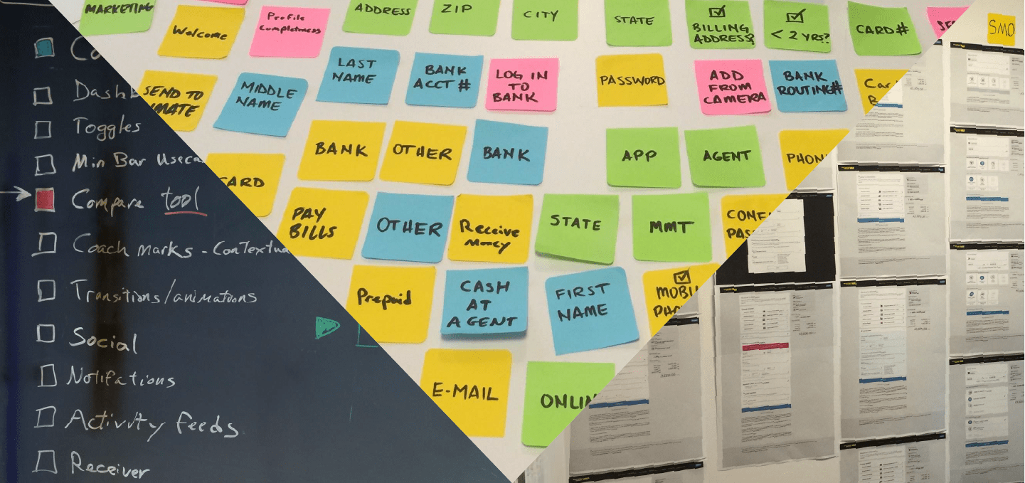
INFORMATION ARCHITECTURE & USER FLOWS
After unterstanding who we are designing for and what competitiveness the new app must have, we revisited the existing user flows in our web/app built in the past, by breaking down the information architecture into fundamental pieces. From there we managed to filter out unnecessary steps and redundant elements that won’t benefit fast and easy money tranfer.
Learn from the past, extract the essence, rebuild on top of the legacy
Even what’s new should honor what already works well. Apart from pursuing the insights of what it takes to send money successfully, maintaining what customers are highly used to carries the continuity of user experience between online and offline moments, and gathers momentum of transition from old product to the new one.
To embody the emerging ideas along with the findings, I started the journey of bringing the new app to life.
From sketches on paper to pixels on screen, mood board to color palette, UI components to design style guide, wireframes to mockups, user flows to interactive prototype. Every step strives to provide meaningful and valuable mobile user experience in the ultimate user’s hands.
EARLY SKETCHS/WIREFRAMES
I used skethces and wireframes to visualize ideas, capture inspirations and reflect thinking process, even to understand why existing web experince was designed to be the way it is, and how that’s going to impact Al Muzaini’s future app product.
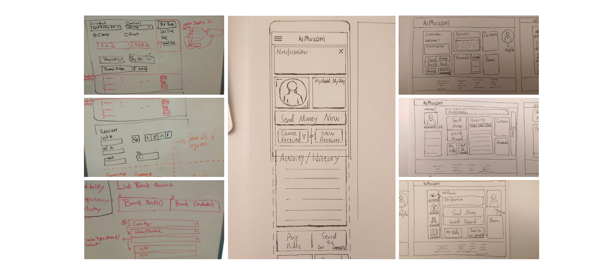
EXPLORE AND ITERATE WITHIN THE CONSTRAINTS
When exploring the UI and user interactions using low-fidelity mockups, certain critical details emerged to require specific treatment, such as the dynamic dependency between fees and exchange rates related to different countries. As a result, conditional notifications and tooltips must be applied accordingly so as to take necessary disclosures and disclamiers into account .
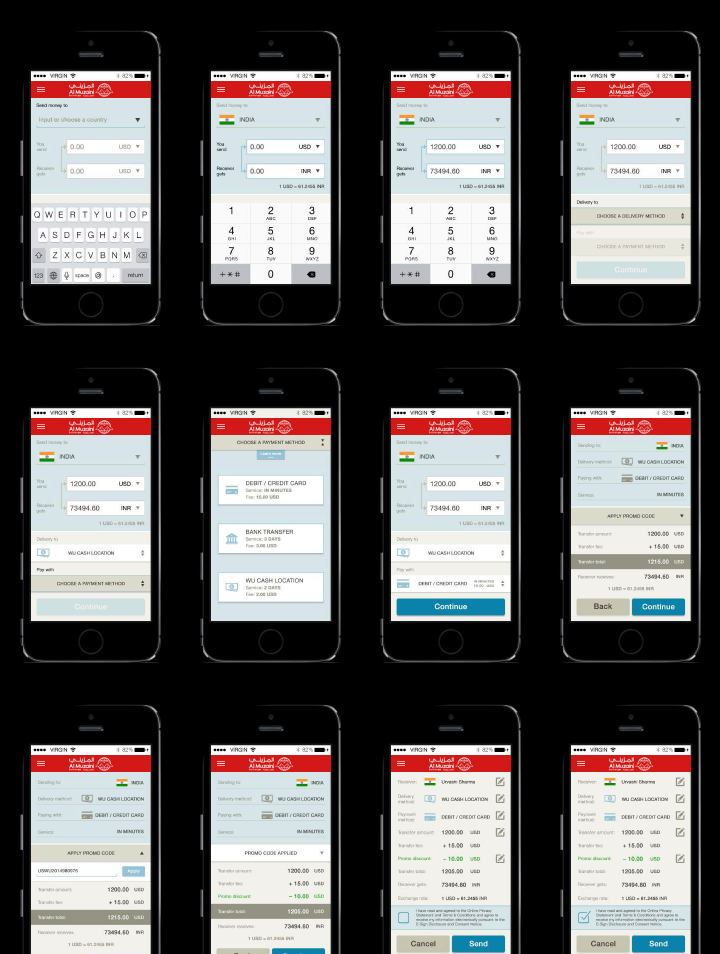
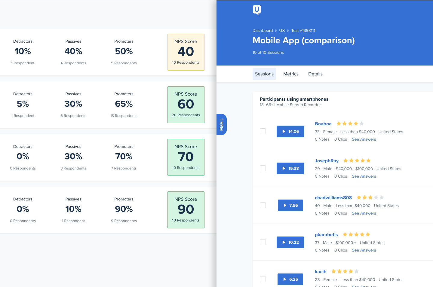
VALIDATE THE DIRECTION WITH USER TESTING
Testing each iteration against the old experince, as well as its previous version on usertesting.com allows me to identify the priorities of what remains to be fixed. Incremental improvements could make constant rewarding progress, even if just minor content changes.
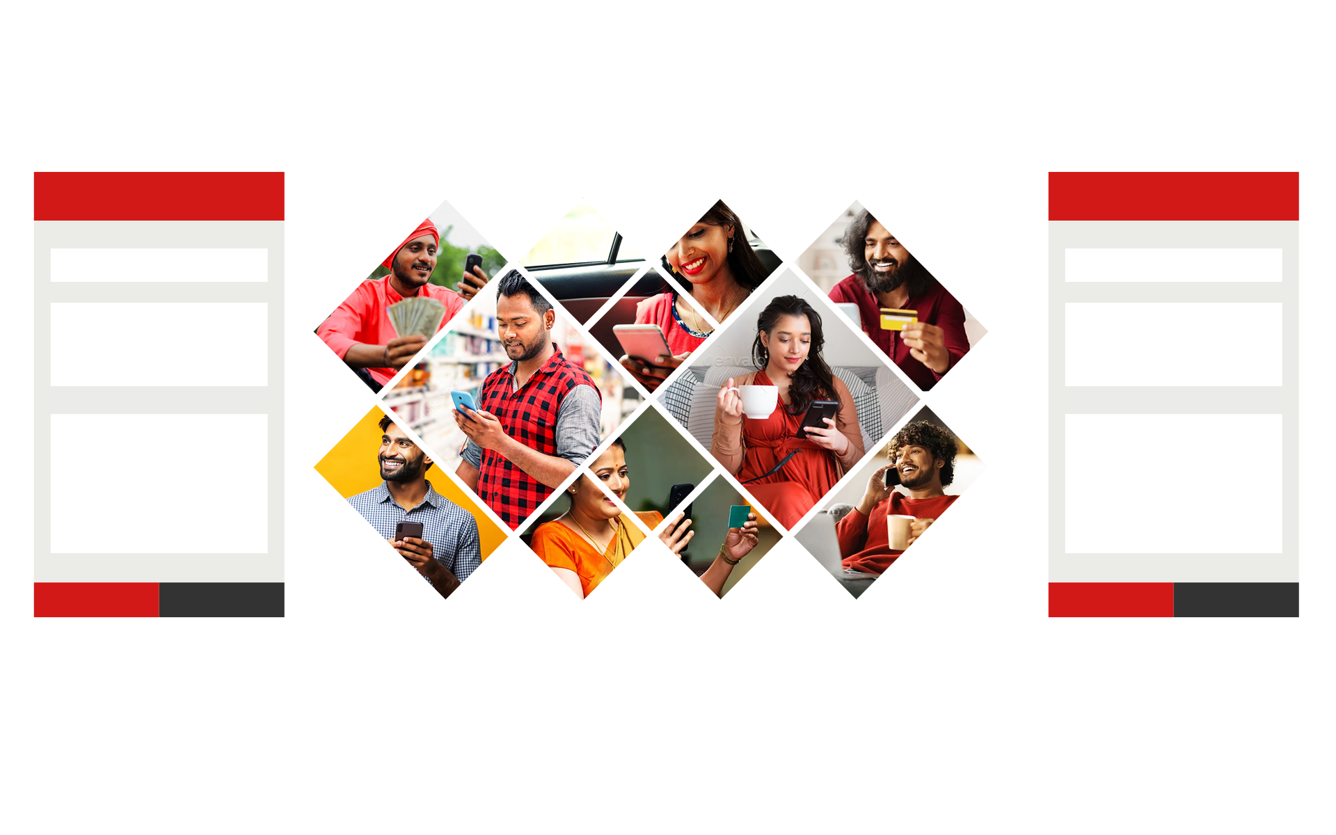
UI themes from the mood board
Face with so many different users with diverse backgrounds internationally, I developed two sets of color palettes that resonate with the majority of cross-culture customers, to reflect their visual preferences expressed in surveys.
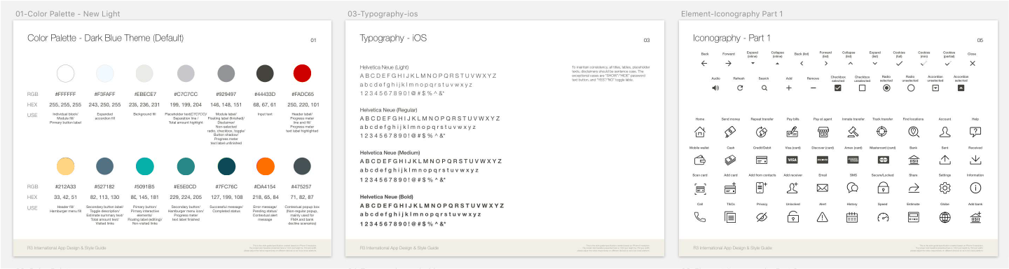
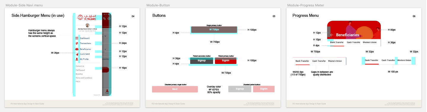
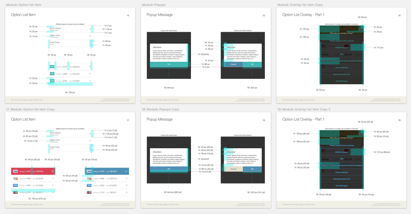
As the building blocks of the app evolve, detailed style guide becomes the must-have for establishing the new standards.
This document grows with the app’s updates over time. Here’s its partial overview. Because of taking the approach of hybird app, the UI elements were designed with the intention of being platform-agnostic. They were inspired by material design and equipped with the spirit of mobile web application.
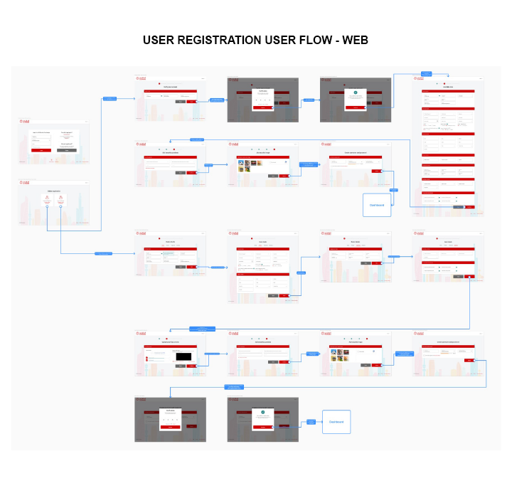
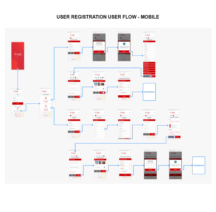
Be contextual, be detailed, be specific. Flows and interactions must be purposefully crafted beyond showing user experince.
Simple features may be full of complexity behind the scene. Working with product, development, content, and legal teams requires more than dealing with time zone differences, it relies on transparent communication and thorough documentation.
An Interaction Flow Sample: This example diagram shows how user registration in the new Al Muzaini app.
The minimum viable product was released as the pilot for international customers first
Until now, the new app has been used by customers in more than 60 countries worldwide, and it continues to reach more and more people.
Finally, the better product is here, the better design to begin
Design is never really done. The next round of observation, ideation, and action is always on the way. From late 2015 to early 2017, we collected great amount of data and feedback, learned many things, adapted the design to accommodate different languages and various reuglations. One day, the time of replacing the old app in the U.S. came eventually, in order to offer all the best we have achieved to the domestic world where everything originally started.
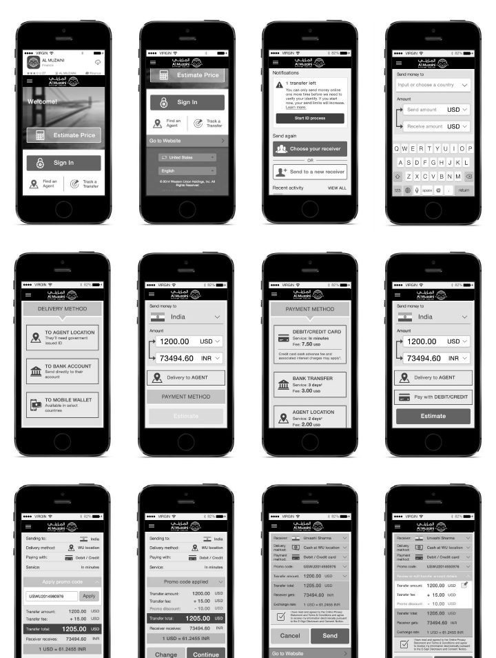
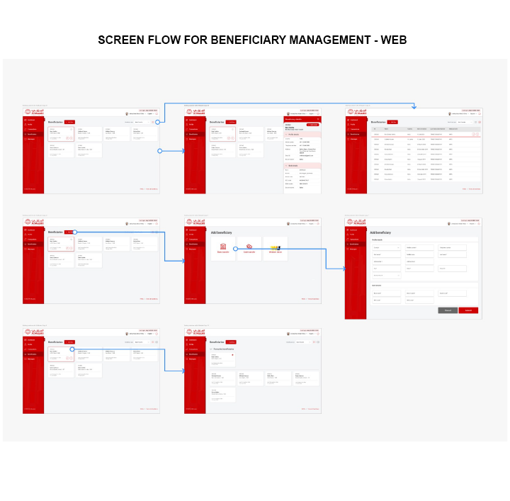
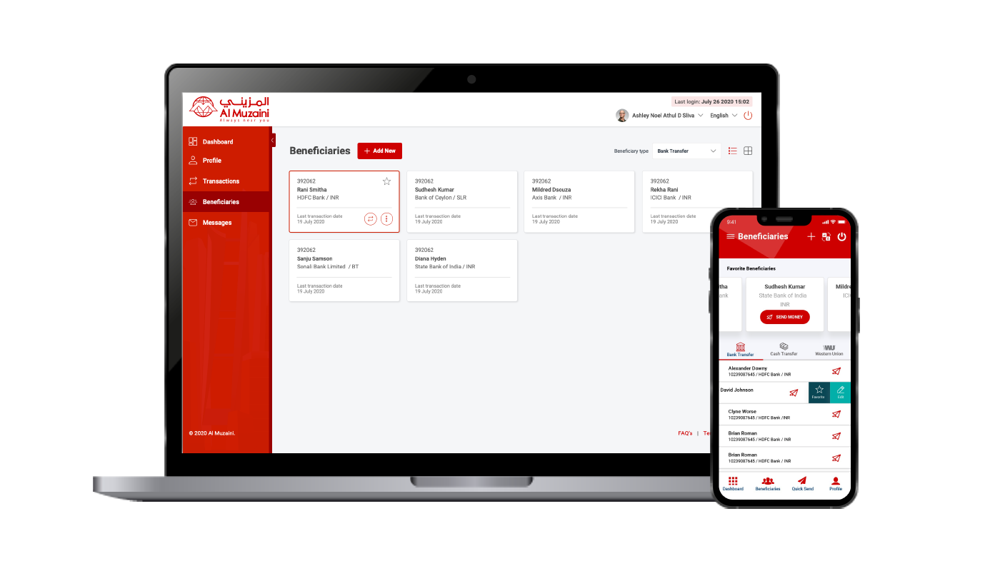
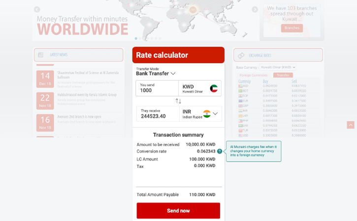
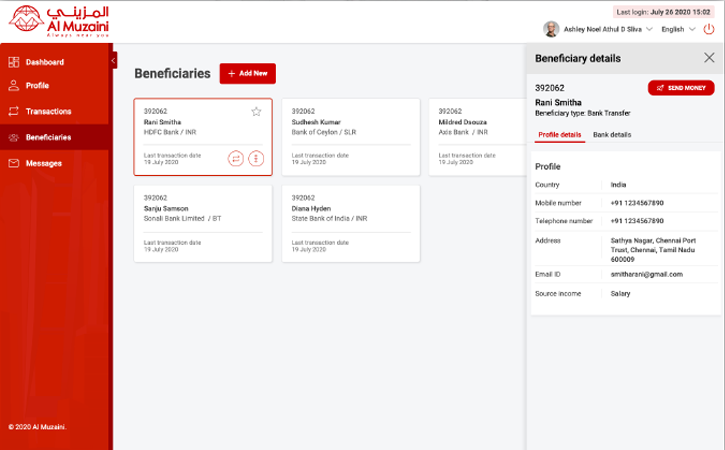
Web Application Screens
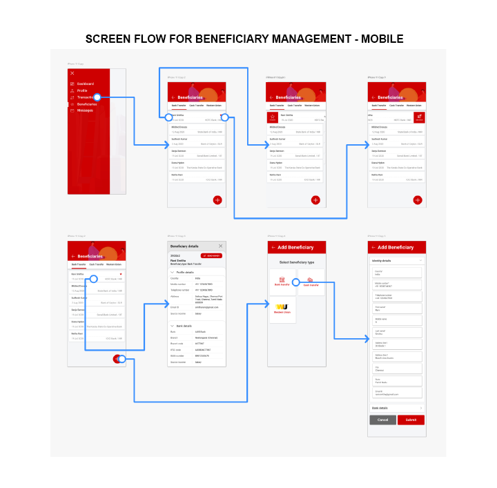
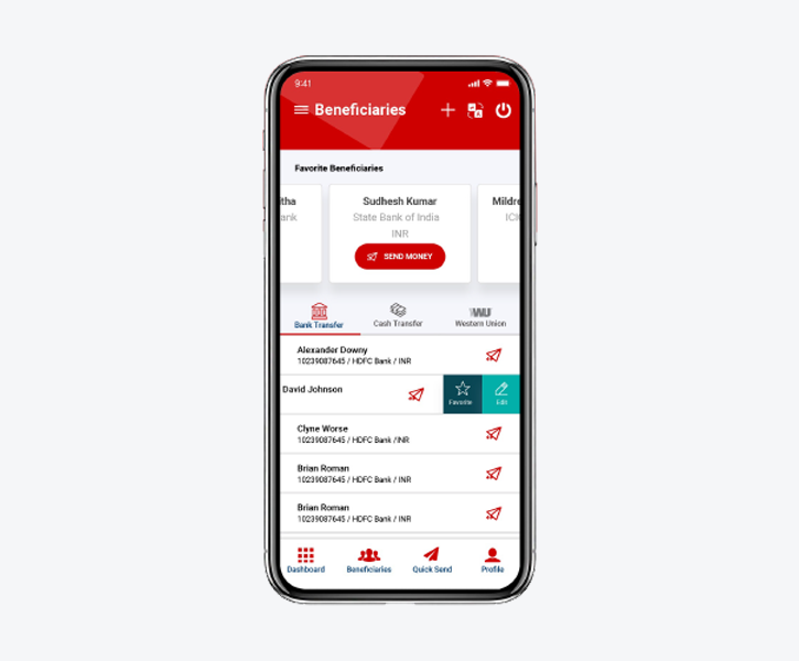
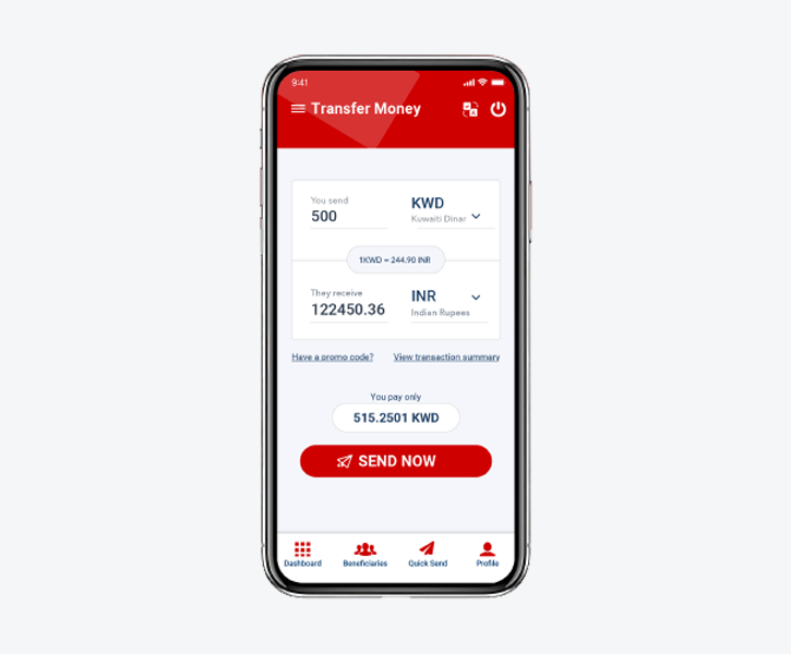
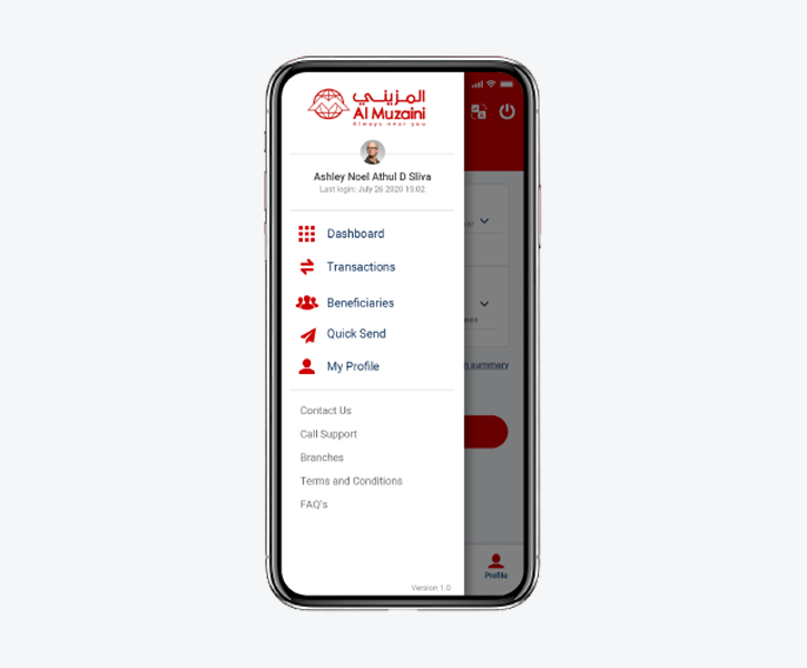
Mobile Application Screens
What did I learn?
Thanks to this project, I was lucky enough to have the opportunity of designing an app which impacts how people send money on such a large scale. When looking back, here is a few things I would like to keep in mind moving forward.
1
Align perspectives with the goal
There are conflicts between user needs and business objectives, product requirements and design principles, technical limitations and desirable outcome. Design does make compromises, but just for the purpose of aligning everyone’s perspectives with the common goal, which brings the team to stay focused.
2
Keep asking why, why not and what if
Questioning a designer himself/herself is no less important than asking questions to a user or a product owner at all. There would be challenges of balancing “think out of the box” and “play it safe”. We need to keep questioning ourselves until knowing what really matters the most before making a design decision.
3
Consistency, not uniformity
In the process of establishing the UI paradigms, what was built before has its reasons to be the way it is, and what is designed now also has its time and place to set the standards. When applying them, define clear rules so that people understand how to use them consistently instead of too literally in a given context.
4
Scalability comes first, trade-offs may follow
The app needs to accommodate English, Chinese, Spanish, German, French and other languages. Sometimes localization inevitably doubles the length of available content. Reducing content iteself is one obvious way, but not at the cost of losing its meaning. Fundamentally, scalability should take higher priority than the most ideal visual result if they cannot be achieved at the same time.