PROJECT OVERVIEW
Apple’s Hardware Definitions Team manages complex product roadmaps and new product definition workflows. Traditionally, this process relied heavily on static documentation — Keynote presentations, spreadsheets, and email threads — which created inefficiencies, limited collaboration, and introduced version control challenges.
To address these gaps, I designed Codex, a secure, web-based tool that brings together product definition content, team communication, and review processes. Codex provides a single source of truth for roadmap management while streamlining collaboration across engineering program managers (EPMs), roadmap managers, and executives.
My Role: I led UX design from discovery through delivery — conducting research, mapping workflows, creating wireframes and prototypes, testing with end users, and delivering high-fidelity designs aligned with Apple’s design system and accessibility standards.
THE CHALLENGE
The Hardware Definitions Team needed a tool that could:
- Replace fragmented static documents with live, centralized data
- Provide real-time visibility into milestones, dependencies, and reviews
- Scale across multiple product lines and hardware teams
- Maintain Apple-grade security and access control
- Support the highly critical ANPP (Apple New Product Process) review flow
The core problem was efficiency: program managers and engineers were spending more time reconciling documents and chasing updates than driving product progress.
THE SOLUTION – CODEX
Codex was designed as an integrated platform with four core modules:
- Roadmaps – Single source of truth for product objectives and schedules
- Products – Live product definitions with ongoing investigations
- Reviews – Streamlined ANPP process with audit trails and approvals
- Portfolios – Comparison views to evaluate programs and align strategy
Key Features:
- ANPP review support with structured workflows
- Audit trail for accountability
- Collaborative document editing and commenting
- Smart search and product data linking
- Security controls with role-based access
- Watermarks for sensitive information
- Dashboards for milestones, dependencies, and progress tracking
Together, these features allowed Codex to elevate both efficiency and security, while creating a more intuitive experience for end users.application to be futuristic manner.
PERSONA’S
To ensure the tool fit real-world workflows, I identified four primary personas:
- Architect EPMs – Manage product definitions, investigations, and review content
- Module EPMs – Manage module-level definitions and investigations
- Roadmap Managers – Organize ANPP events and audiences
- Executives – Review and approve product proposals
I also designed experiences for multiple user roles (Admins, Creators, Editors, Viewers) with clear permissions and tailored access.
DESIGN PROCESS
Discovery
- Conducted interviews with EPMs, roadmap managers, and executives
- Identified pain points: reliance on static docs, lack of version control, difficult review tracking
- Defined success metrics: time saved, collaboration improvements, and security compliance
Design & Prototyping
- Created user flows mapping end-to-end processes, from product definition through ANPP review
- Developed wireframes and interactive prototypes to explore different navigation and dashboard options
- Designed data visualizations to simplify tracking milestones and dependencies
Validation
- Led usability testing sessions with target personas
- Incorporated iterative feedback loops to refine interactions and workflows
- Adjusted navigation and dashboard structures to improve findability and ease of use
Delivery
- Produced high-fidelity designs aligned with Apple’s design system
- Ensured WCAG accessibility compliance (contrast, typography, interaction design)
- Partnered closely with engineering to ensure feasibility and scalability
IMPACT
Codex transformed Apple’s product roadmap management from static and fragmented to dynamic, collaborative, and secure.
- Replaced email/Keynote workflows with a centralized platform
- Improved review efficiency and accountability with audit trails
- Gave executives real-time visibility into program status
- Created a scalable foundation for managing multiple hardware projects across teams
Ultimately, Codex enabled hardware engineering teams to focus on innovation and execution, rather than chasing documentation.
UX Flow Showcase
1. User Journey Map
Purpose: Show how different personas (EPMs, Roadmap Managers, Executives) interact with Codex in their day-to-day work.
Visual to create: A journey map with rows for actions, tools, pain points, opportunities, and Codex solutions.
Example scenario – Architect EPM:
- Current State: Gathers product data in spreadsheets → shares via email → waits for feedback → updates slides for ANPP review.
- With Codex: Logs into Codex → updates live product definition → collaborators add comments → dependencies are auto-linked → ANPP review package is generated directly.
👉 Visual cue: Timeline from Product Definition → Investigation → ANPP Review → Executive Approval, showing how Codex reduces friction at each step.
2. User Flows
Purpose: Demonstrate the step-by-step workflows Codex supports.
Visuals to create: Simplified flow diagrams (boxes + arrows) for core modules.
Examples:
- Roadmap Manager Flow: Create roadmap → assign milestones → set dependencies → share with EPMs → schedule ANPP review.
- Executive Reviewer Flow: Receive notification → open review in Codex → comment inline → approve/reject with audit trail.
- Module EPM Flow: Log investigation → attach findings → link to product definition → flag dependencies.
👉 Each flow should highlight how Codex consolidates actions that previously required multiple tools.
3. Wireframes & Iterations
Purpose: Show your design thinking in action.
Visuals to include:
- Early wireframes of dashboards, roadmap timelines, and review screens.
- Iterations that evolved based on feedback (e.g., simplified navigation, reorganized review details, clearer dependency visuals).
👉 Use side-by-side “v1 → v2 → final” progression to highlight usability improvements.
4. High-Fidelity Designs / Mockups
Purpose: Bring the final solution to life and show alignment with Apple’s design language.
Visuals to include:
- Roadmaps Dashboard: Interactive timeline with milestones, dependencies, and filtering.
- Product Definition Screen: Editable structured fields with linked investigations and smart search.
- Review Workflow: Approval flow with inline commenting and security features (watermarks, access roles).
- Portfolio Comparison: Side-by-side product views with key metrics for decision-making.
👉 These should feel polished, consistent, and scalable — reflecting the enterprise-level tool you designed.
5. Data Visualization Dashboards
Purpose: Show how complex project data is made clear and actionable.
Visuals to include:
- Milestone tracker (timeline or Gantt-style)
- Dependency mapping (network or flow diagram)
- Progress metrics (completion percentages, risk indicators, upcoming deadlines)
👉 Position these as decision-making tools for executives and program managers.
6. Accessibility Considerations
Purpose: Show that inclusivity was part of your process.
Visuals to include:
- Color palette demonstrating contrast compliance
- Scalable typography examples
- Responsive layouts (desktop/tablet views)
👉 This will emphasize your attention to Apple’s accessibility standards.
User Centric Design
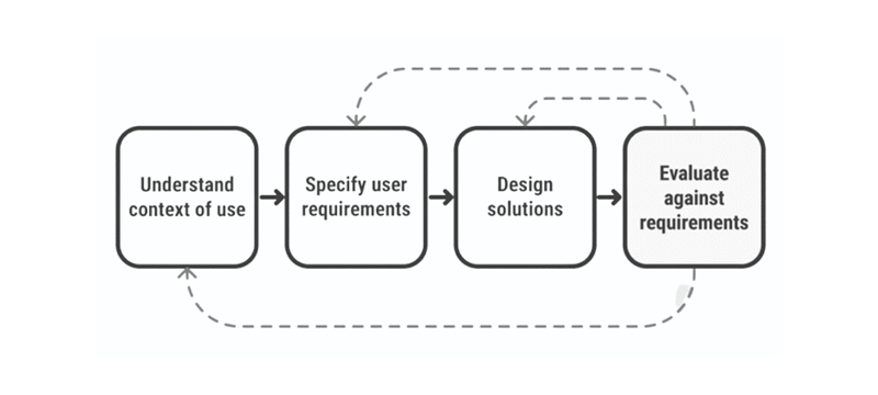
Design workflow that we followed throughout our process
Phase-1:
Identify a problem through user research
- Need to know what problem and why it is need to be solved?
- Need to know who are the users?
- Need to know what is the existing situation and why is it
Phase-2:
Analysis a problem
- Create User Personas
- Create User stories
Phase-3:
Ideate Solutions
- Create Sketches
- Create Low fidelity wireframes
- Create High fidelity wireframes
- Create Prototypes
Phase-4:
Analyse how good the design is
- Validate the design flow
- Validate with other team members
- Validate with end user
Phase-5:
Iterate
- Improvise the design flow & Developer handover
GOALS & PLANS
- Make the app simple, easy, accessible and usable
- Keep UX consistant across the platform
- Create a product that is enjoyable for routine/frequent tasks
How we get started our customers to participate?
We started off our research by conducting interviews. We wanted to learn more about potential users and to understand their behaviours and thoughts.
USER RESEARCH
We need to know what problem we’re solving. Spending time solving a problem that doesn’t exist or isn’t valuable to users is a waste of time, money and effort for everyone involved. So, we need to understand the problems people face.
Questions that we need to ask ourself during the research phase
Below is a list of questions that we have asked the stakeholders during this phase.
In the end, we will find out the solutions.
- What is the problem?
- Who is our users?
- Why it is need to be solved?
- What is the existing situation?
- Why is it necessary?
- What are the biggest drawbacks to the current process?
- What are the positives of the current process? What works well?
Interview to improvise the current design
Time : 40-50 Mins | Number of Users interviewed: 12
Module: Invoice
Inpatient:
- How will the End Cash balance functionally work or it will be common for all 3 Invoices ?
- How many types of User profile banner scenarios do we have in the whole app?
- Need more clarity View Coverage label
- Need more clarity between services and medication
- Need to understand scenarios more about assign doctor in accept Order
- Who will be adding the patient Checklist data
Over the counter:
- How does the Barcode scan Functionality work in this module ?
- Whether we need to showcase the list of the Medicine In/out stock and Expiry product list
- Whether we have feasibility to manually add new product which is not available in system
Outpatient:
- Appointments – Whether we have option to cancel the appointment
- We can’t able to see the data for scheduled appointment’s vs walk-ins
- We are unable add walk-in appointment and Create invoice for the patient
USER FEEDBACK
Concerns from Users: Design Consistency for below need to be worked out for all the modules
- Top Header
- Left Nav Panel
- Search
- Patient Card
- Design System : Need to standardise and strengthen the design system
Our Goal – Value Add with New Navigation
Hiding complexity – User should not get confused, with too much of info to consume.
Recognition vs recall – User need not remember anything, they should be able to identify once they see it.
Help- Should be easy to figure-out of they have some question.
ACCESSIBILITY
- Many screens looks cluttered.
- Table view font sizes are too small for some users.
- Large tables can be difficult to read due to similar data being in sequential cells.
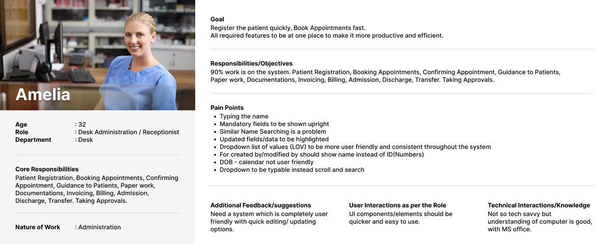
Persona -1 : Receptionist
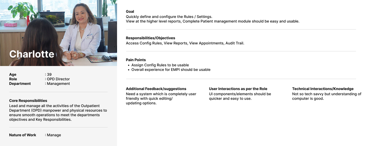
Persona – 2 : OPD Director
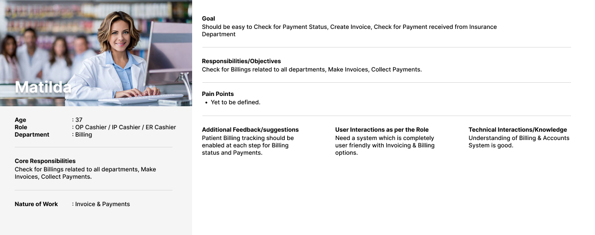
Persona – 3 : Cashier
User Flow – Receptions
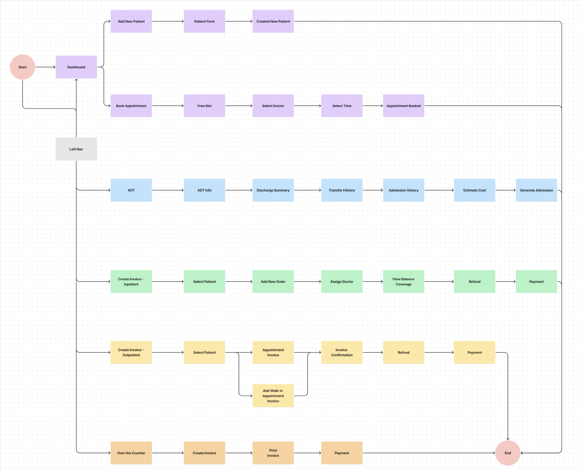
Rough Sketch
1. Patient Details Screen
1. Overall View Screen
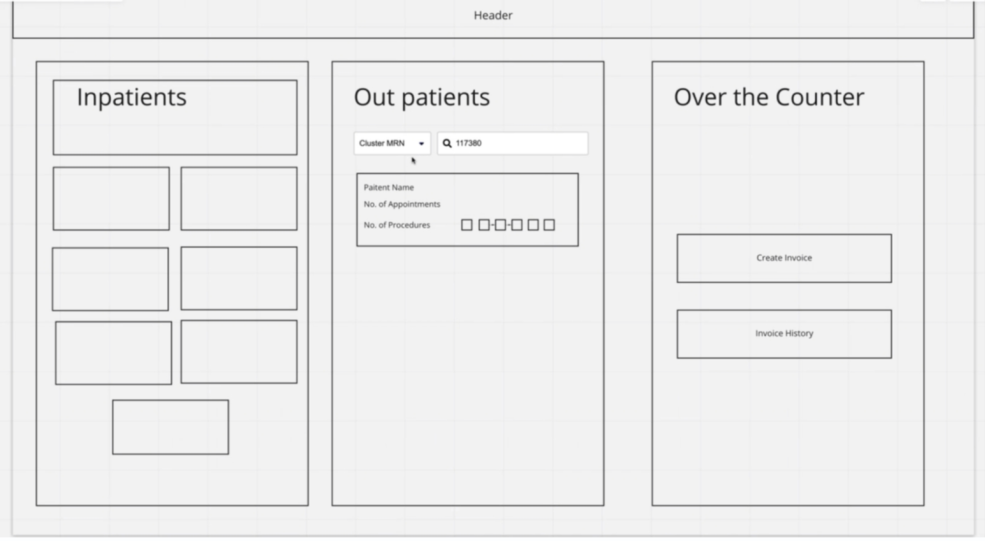
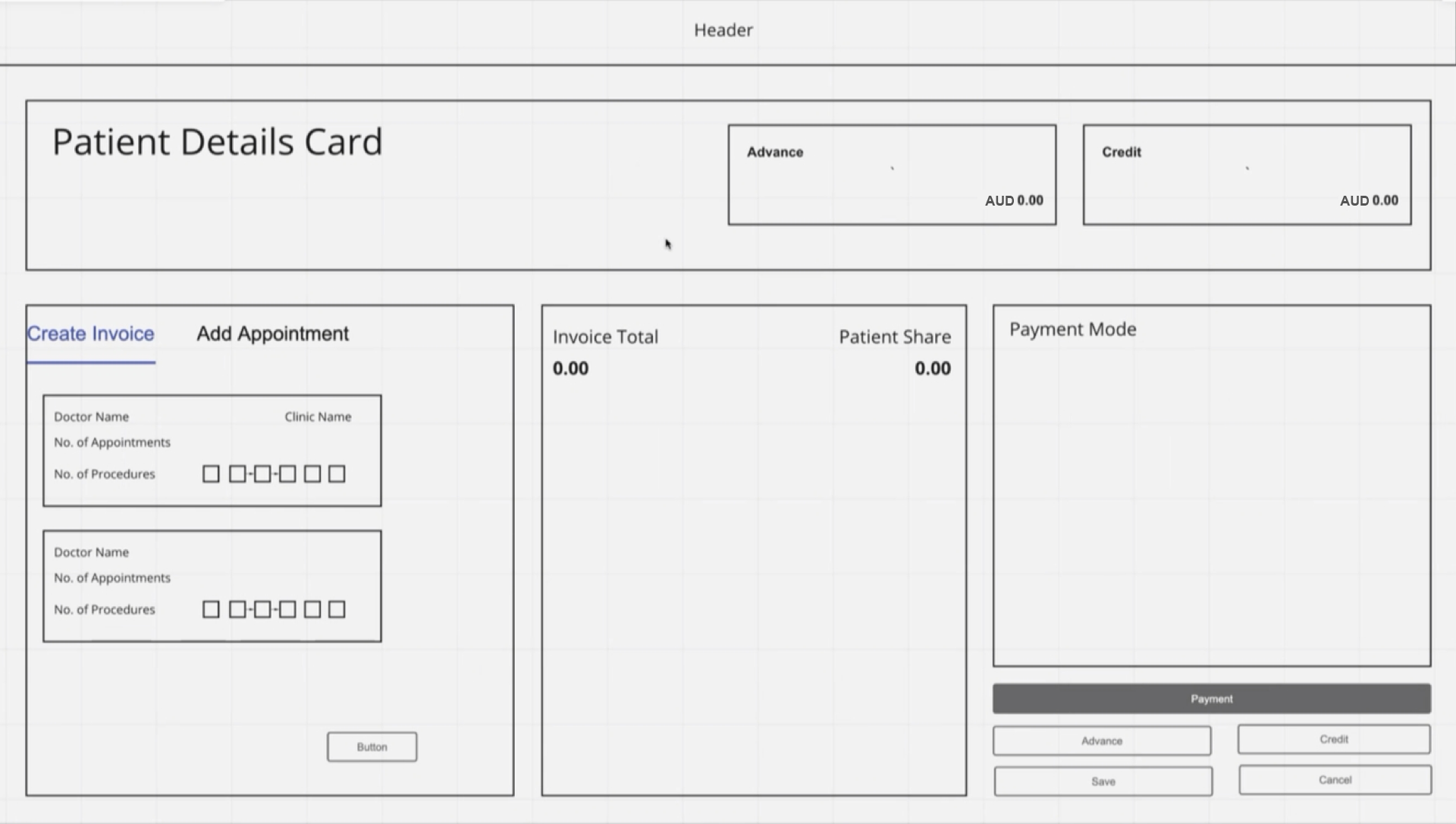
LOW FIDELITY WIREFRAME’S
1. Patient Payment Details Screen
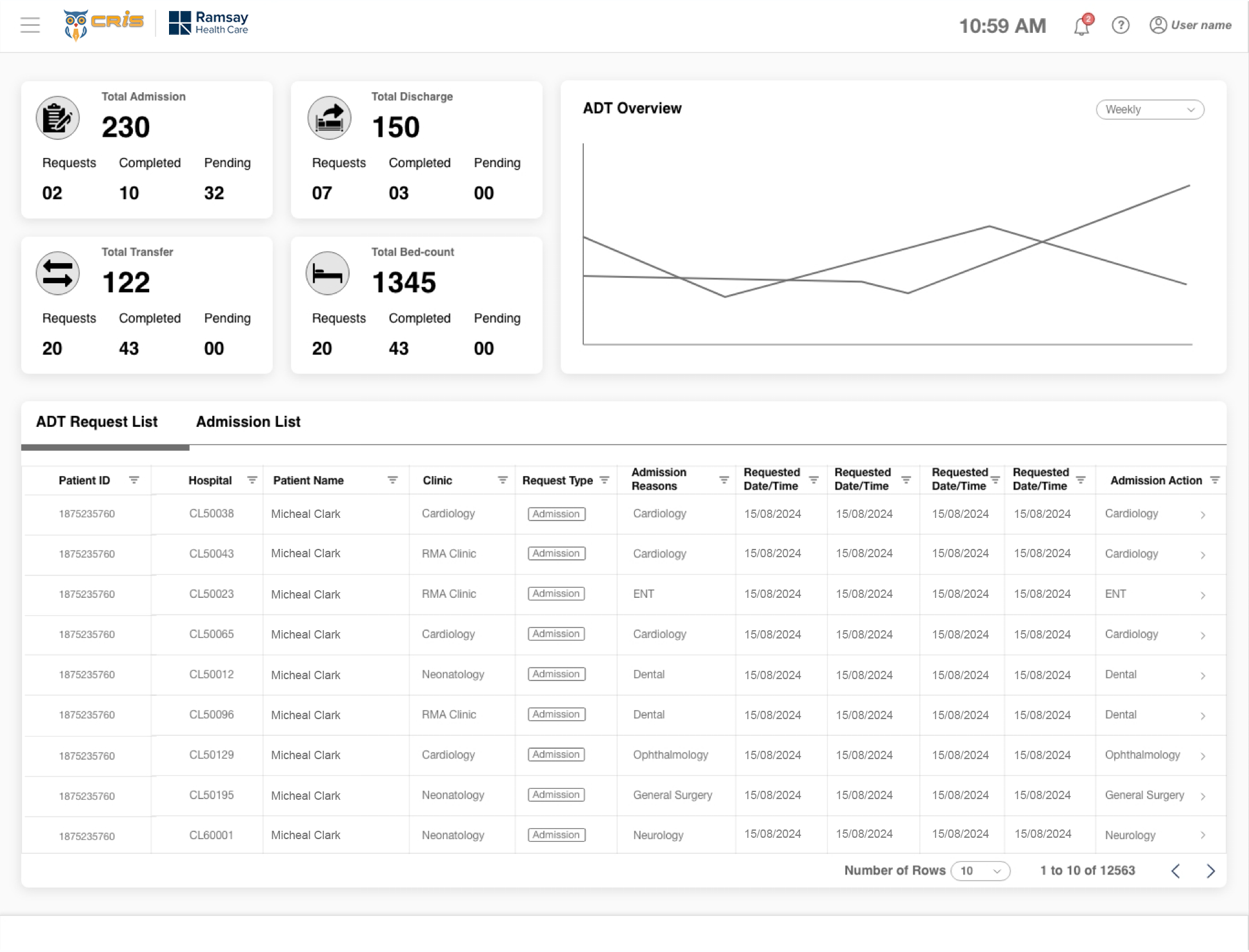
2. ADT Dashboard
3. Patient Book Appointment Screen
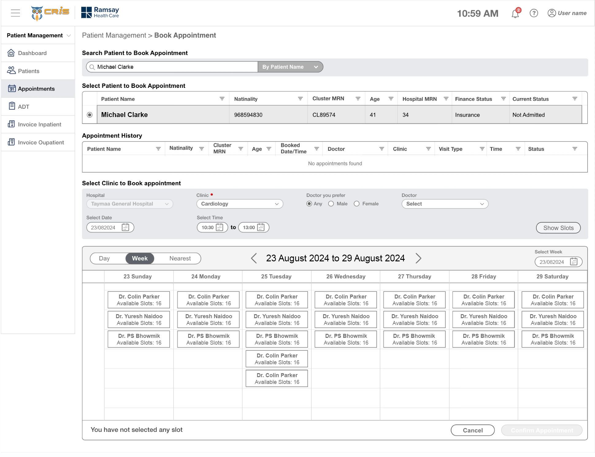
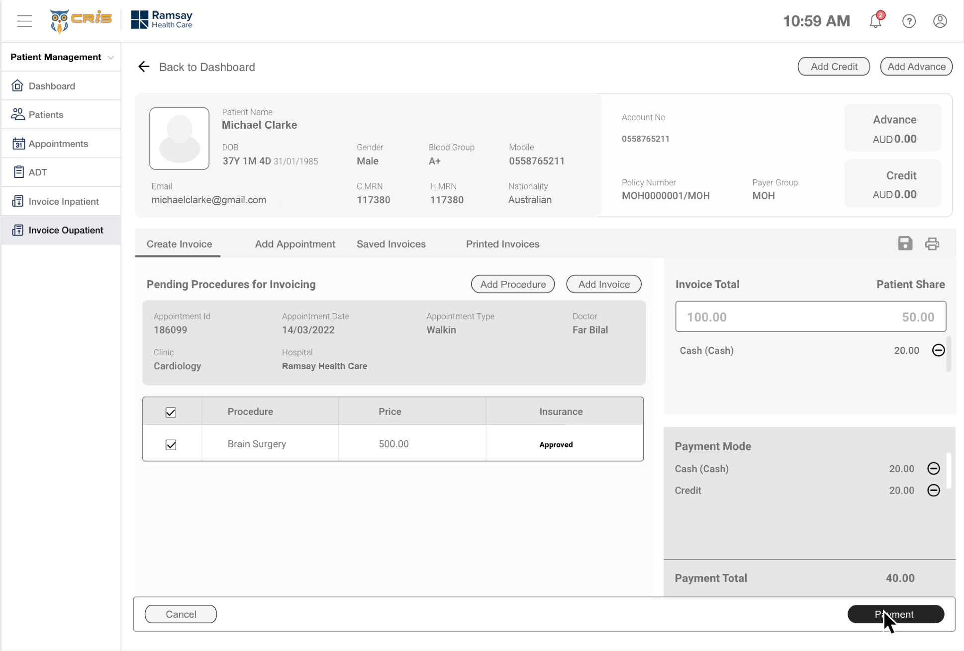
HIGH FIDELITY DESIGN’S
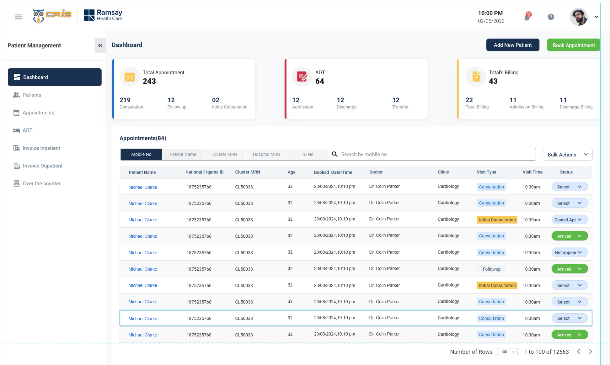
1. Receptionist Dashboard
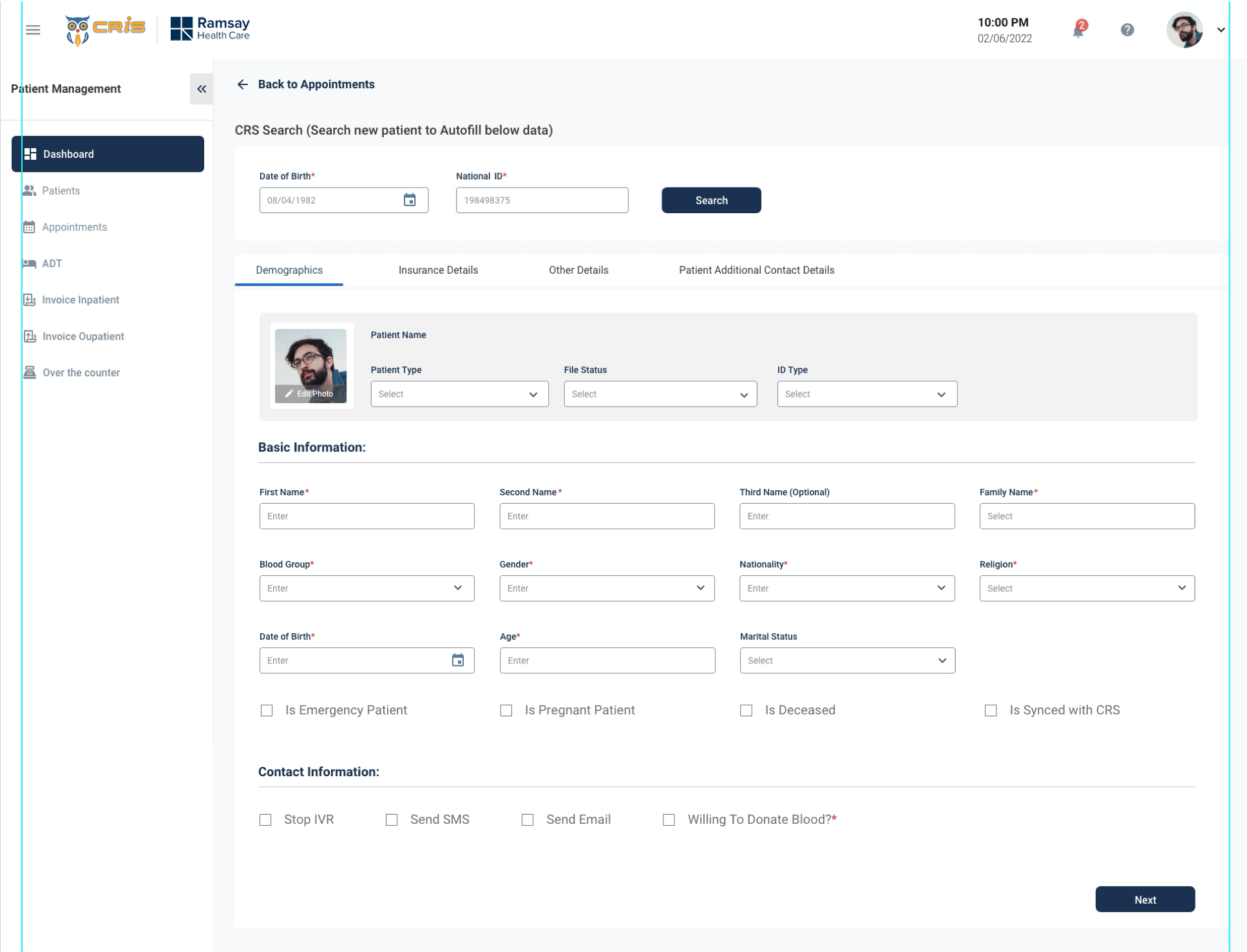
2. Patient Form
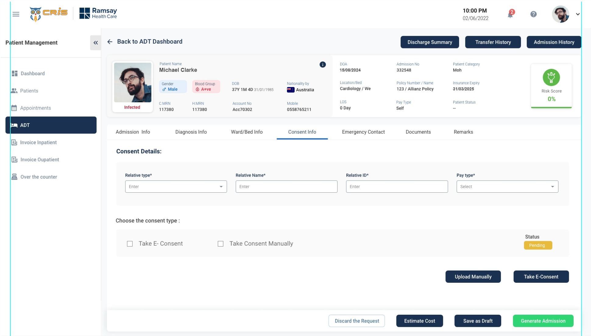
3. Patient ADT
DESIGN COMPARATIVE
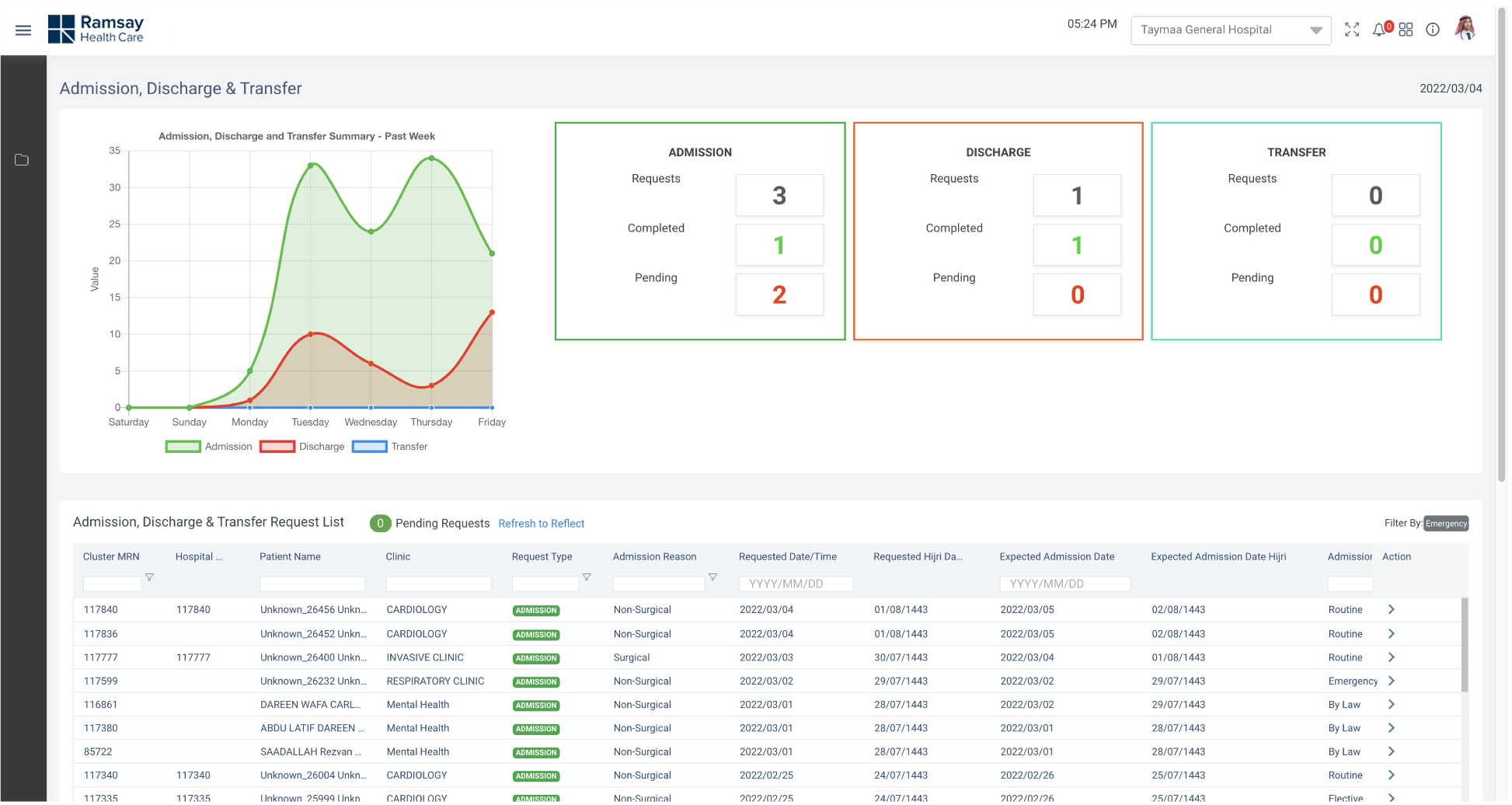
1. ADT Dashboard (Before)
1. ADT Dashboard (After)
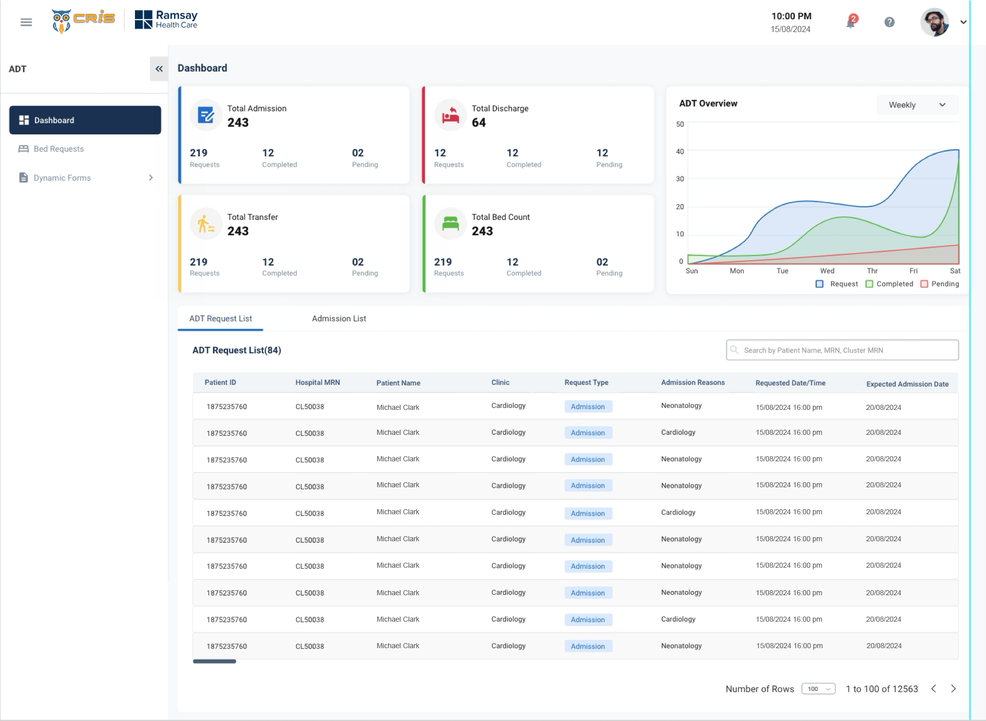
- We re-organised the entire dashboard based on user priority
- We redesigned the entire table.
- We worked on Ul part to make the application more
Patient Payment Details (Before)
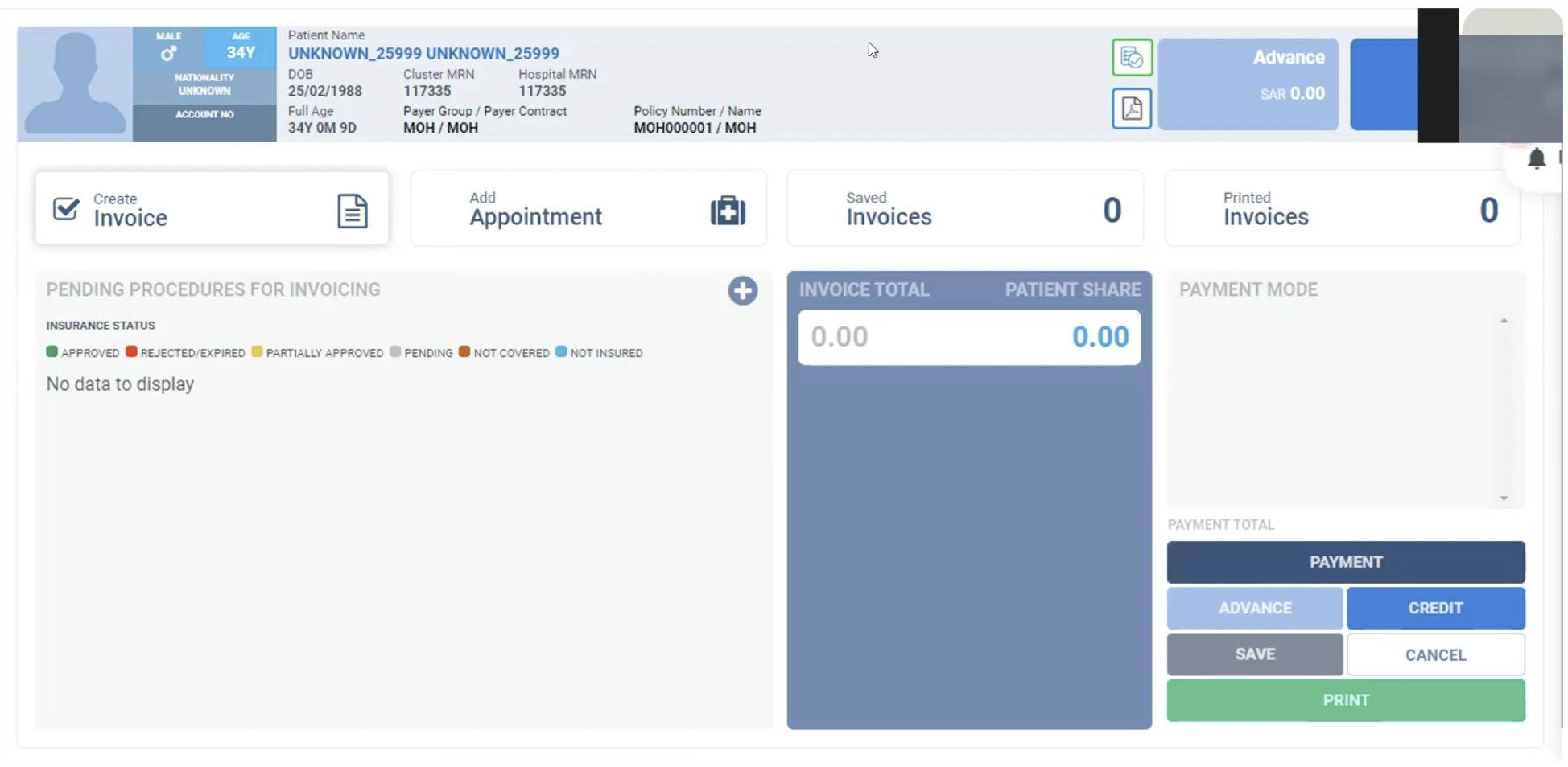
Patient Payment Details (After)
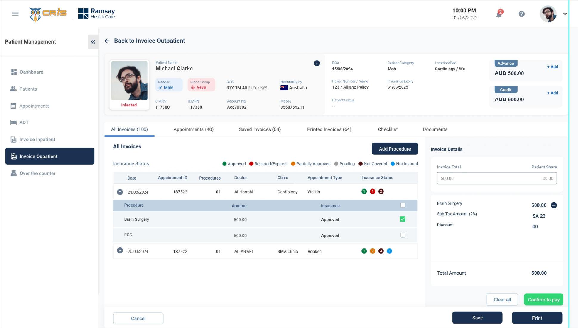
- We re-organised the entire screen based on user priority
- Too many button will confuse the user. So we reduced the button.
- We worked on layout(3 layout into 2 layout) .
- We worked on Patients details based on the
Patient Detail Screen (Before)
Patient Detail Screen (After)
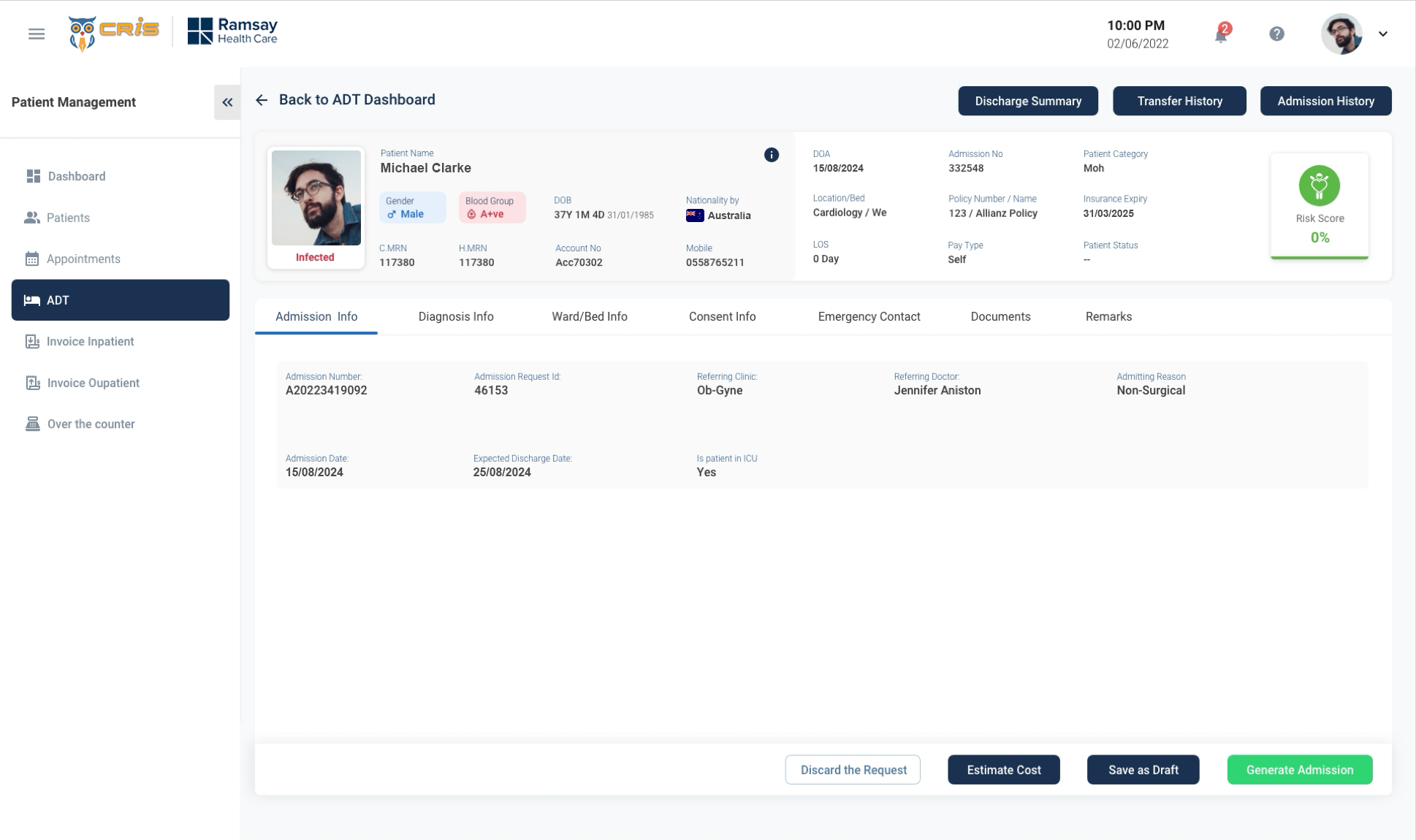
- We re-design the entire screen to make it more simple and easy to navigate.
- Too much vertical scroll reduced by providing tab view.
- Risk Score has placed in right side of the screen to get users attention.
- We grouped the information of users and placed it under each tab to make it more simple.
USABILITY TESTING
Method Used: Moderated Remote Testing (Zoom Calls)
- Total Users participated – 9/10
- Reception/Front Desk-4
- Medical Directors – 2
- Finance team – 3
- Dashboard Efficiency ?
- Invoice Process improvement.
- Productivity in Patient Management.
- Efficient Reporting to the Leadership
Usability Measures (on a scale of 1-7)
- Intuitiveness – 6
- Ease of Use – 6
- Visual Design – 7
- Productivity – 6
- Overall Satisfaction -6
Additional Feedback received
- Dashboard needs some more reporting KPI’s
- Ul looks much fresh and vibrant, when compared to the previous Ul.
- Can we have personalised screens like the dashboard, based on roles?
- Invoice team do not need a lot of information around the patient.
- What are the opportunities of automation?