PROJECT INTRODUCTION
Cris.Care Project speaks about how we redesign the healthcare management app for Cris.Care. Cris.Care is a daily used application by the hospital management. This will be enabling hospitals to manage information and data related to all aspects of healthcare – processes, providers, patients, and more, which in turn ensures that processes are completed swiftly and effectively.
THE CHALLENGE
Cris.Care came to us for the better Ul and UX approach in the application. The current design has many complication and confusion while using the application. For example too many button in same screen will make user confused.
We came up with the solution to solve this in our design.
THE SOLUTION
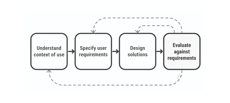
We developed a solution by applying the User-Centered Design (UCD) process. UCD is an iterative approach that prioritizes users and their needs at every stage of the design process.
We involve users throughout the design process via a variety of research and design techniques, to create highly usable and accessible products for them. We understand our users, their tasks, and environments. Based on that we redesign the application to be futuristic manner.
DESIGN PROCESS
User Centric Design
Design workflow that we followed throughout our process
Phase-1:
Identify a problem through user research
- Need to know what problem and why it is need to be solved?
- Need to know who are the users?
- Need to know what is the existing situation and why is it
Phase-2:
Analysis a problem
- Create User Personas
- Create User stories
Phase-3:
Ideate Solutions
- Create Sketches
- Create Low fidelity wireframes
- Create High fidelity wireframes
- Create Prototypes
Phase-4:
Analyse how good the design is
- Validate the design flow
- Validate with other team members
- Validate with end user
Phase-5:
Iterate
- Improvise the design flow & Developer handover
GOALS & PLANS
- Make the app simple, easy, accessible and usable
- Keep UX consistant across the platform
- Create a product that is enjoyable for routine/frequent tasks
How we get started our customers to participate?
We started off our research by conducting interviews. We wanted to learn more about potential users and to understand their behaviours and thoughts.
USER RESEARCH
We need to know what problem we’re solving. Spending time solving a problem that doesn’t exist or isn’t valuable to users is a waste of time, money and effort for everyone involved. So, we need to understand the problems people face.
Questions that we need to ask ourself during the research phase
Below is a list of questions that we have asked the stakeholders during this phase.
In the end, we will find out the solutions.
- What is the problem?
- Who is our users?
- Why it is need to be solved?
- What is the existing situation?
- Why is it necessary?
- What are the biggest drawbacks to the current process?
- What are the positives of the current process? What works well?
Interview to improvise the current design
Time : 40-50 Mins | Number of Users interviewed: 12
Module: Invoice
Inpatient:
- How will the End Cash balance functionally work or it will be common for all 3 Invoices ?
- How many types of User profile banner scenarios do we have in the whole app?
- Need more clarity View Coverage label
- Need more clarity between services and medication
- Need to understand scenarios more about assign doctor in accept Order
- Who will be adding the patient Checklist data
Over the counter:
- How does the Barcode scan Functionality work in this module ?
- Whether we need to showcase the list of the Medicine In/out stock and Expiry product list
- Whether we have feasibility to manually add new product which is not available in system
Outpatient:
- Appointments – Whether we have option to cancel the appointment
- We can’t able to see the data for scheduled appointment’s vs walk-ins
- We are unable add walk-in appointment and Create invoice for the patient
USER FEEDBACK
Concerns from Users: Design Consistency for below need to be worked out for all the modules
- Top Header
- Left Nav Panel
- Search
- Patient Card
- Design System : Need to standardise and strengthen the design system
Our Goal – Value Add with New Navigation
Hiding complexity – User should not get confused, with too much of info to consume.
Recognition vs recall – User need not remember anything, they should be able to identify once they see it.
Help- Should be easy to figure-out of they have some question.
ACCESSIBILITY
- Many screens looks cluttered.
- Table view font sizes are too small for some users.
- Large tables can be difficult to read due to similar data being in sequential cells.
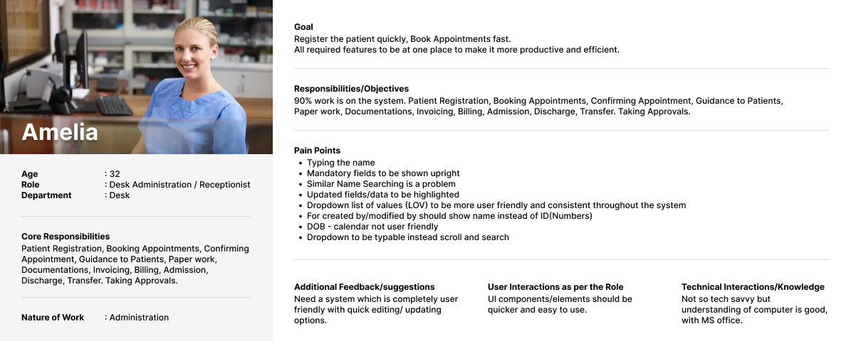
Persona -1 : Receptionist
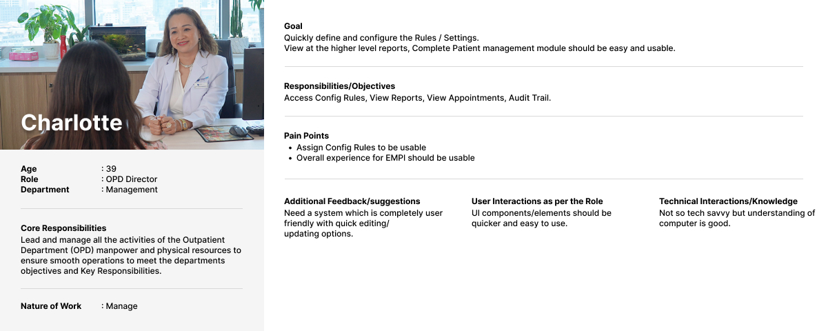
Persona – 2 : OPD Director
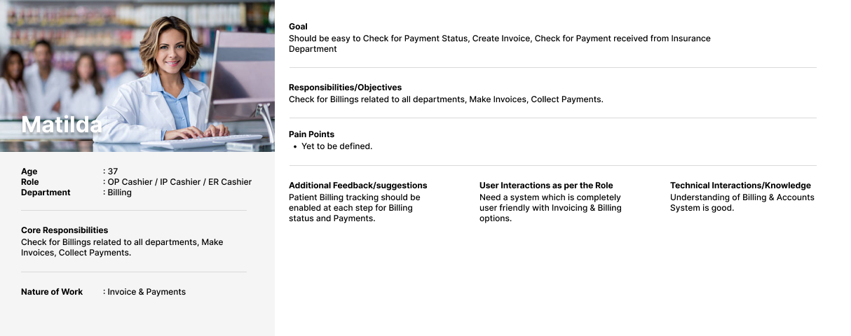
Persona – 3 : Cashier
User Flow – Receptions
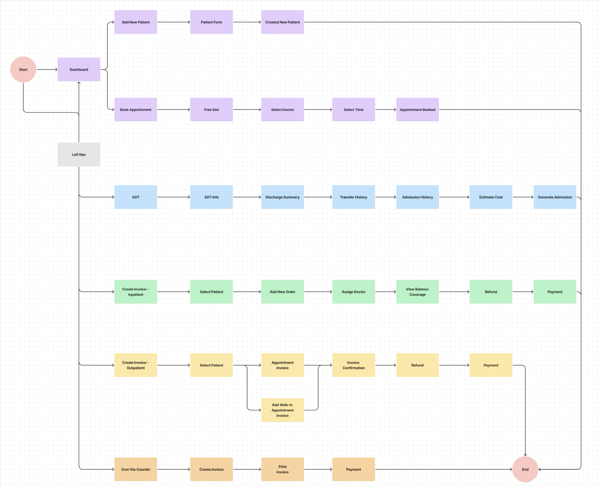
Rough Sketch
1. Patient Details Screen
1. Overall View Screen
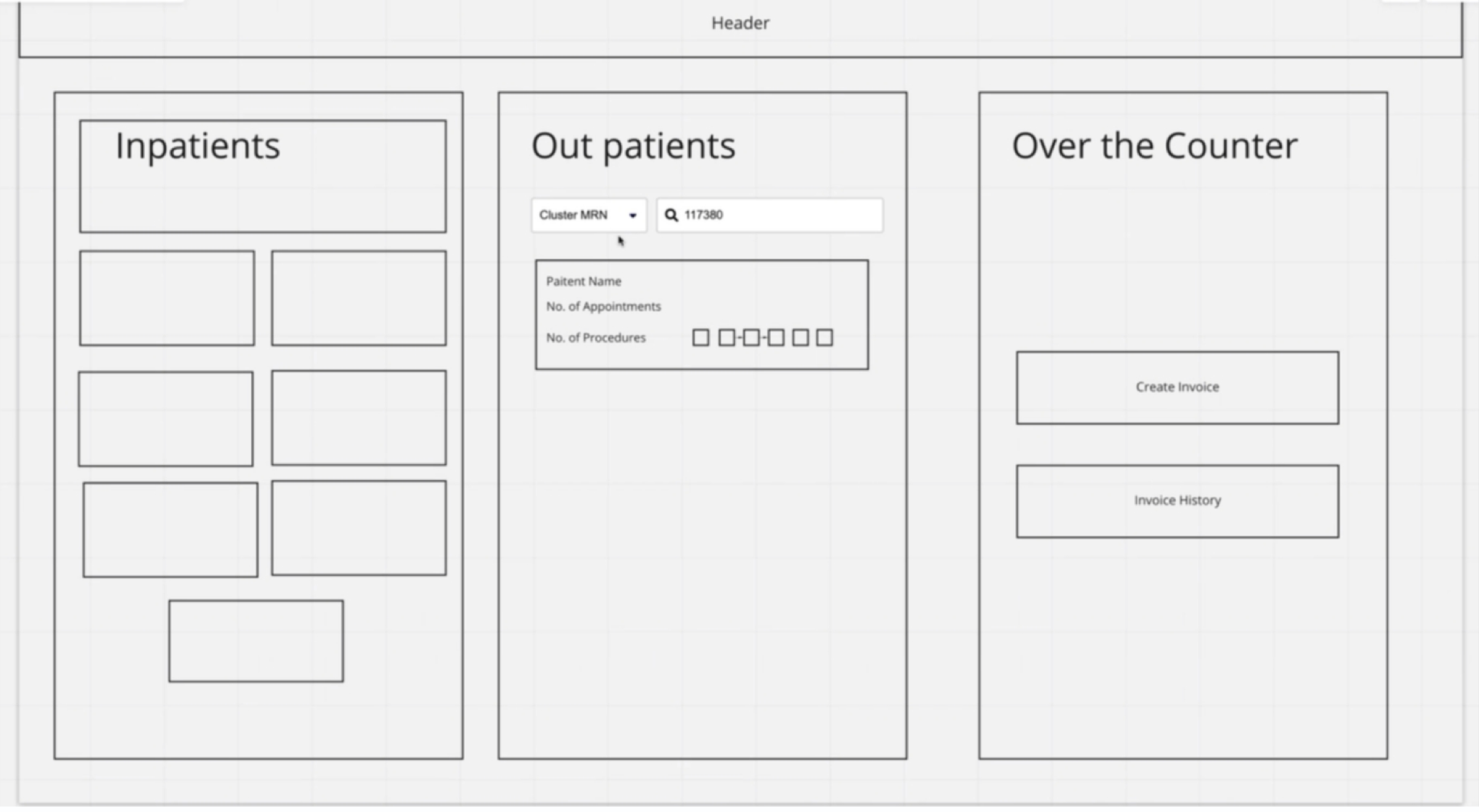
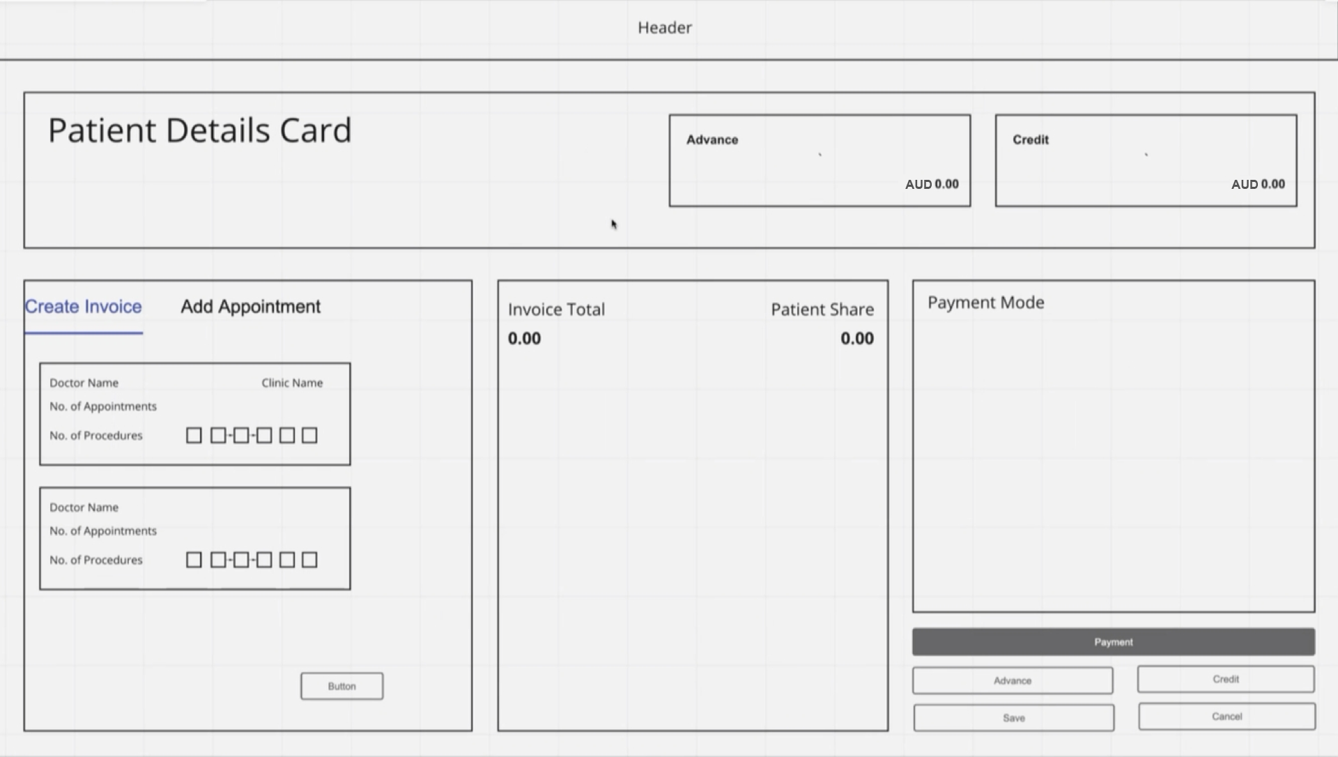
LOW FIDELITY WIREFRAME’S
1. Patient Payment Details Screen
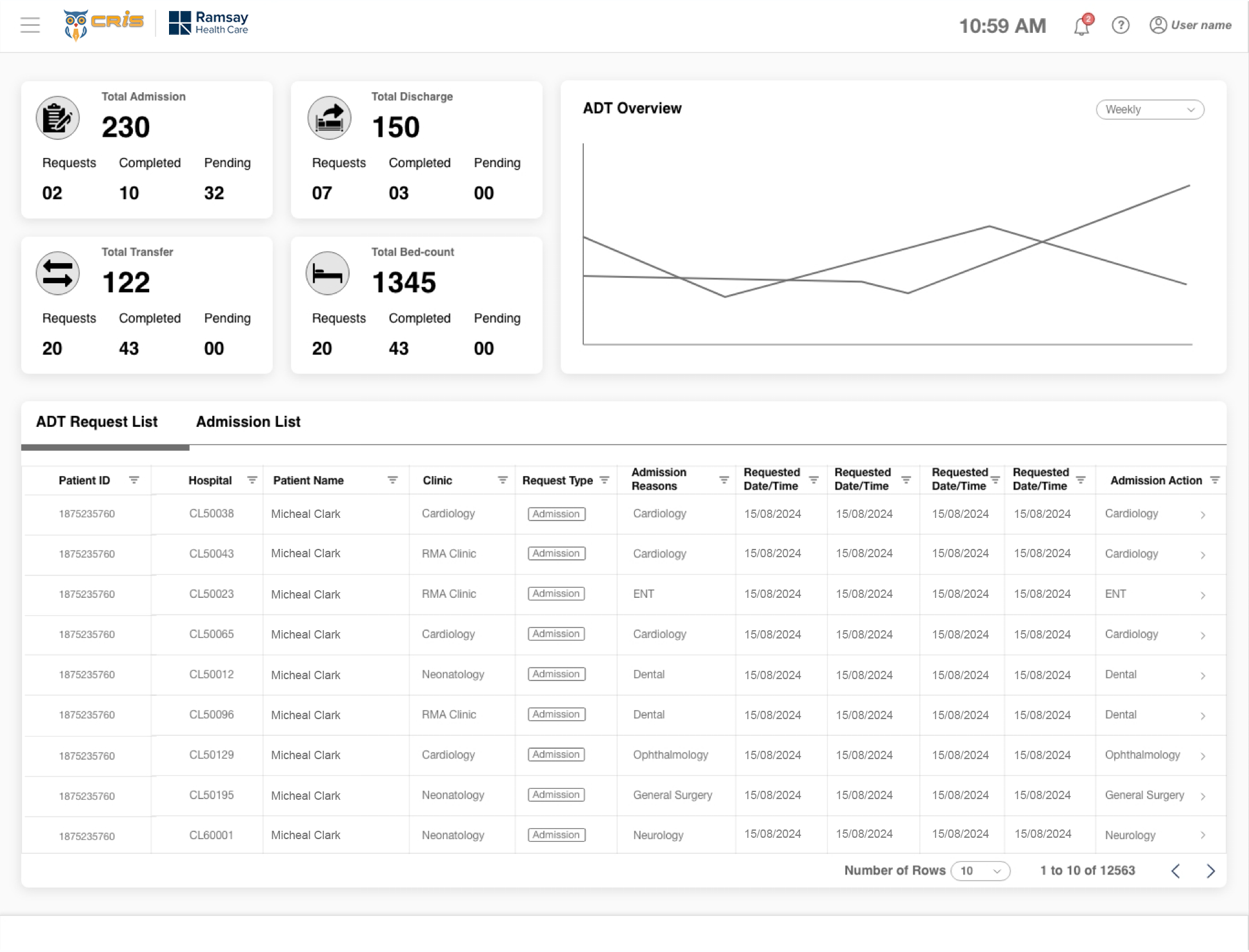
2. ADT Dashboard
3. Patient Book Appointment Screen
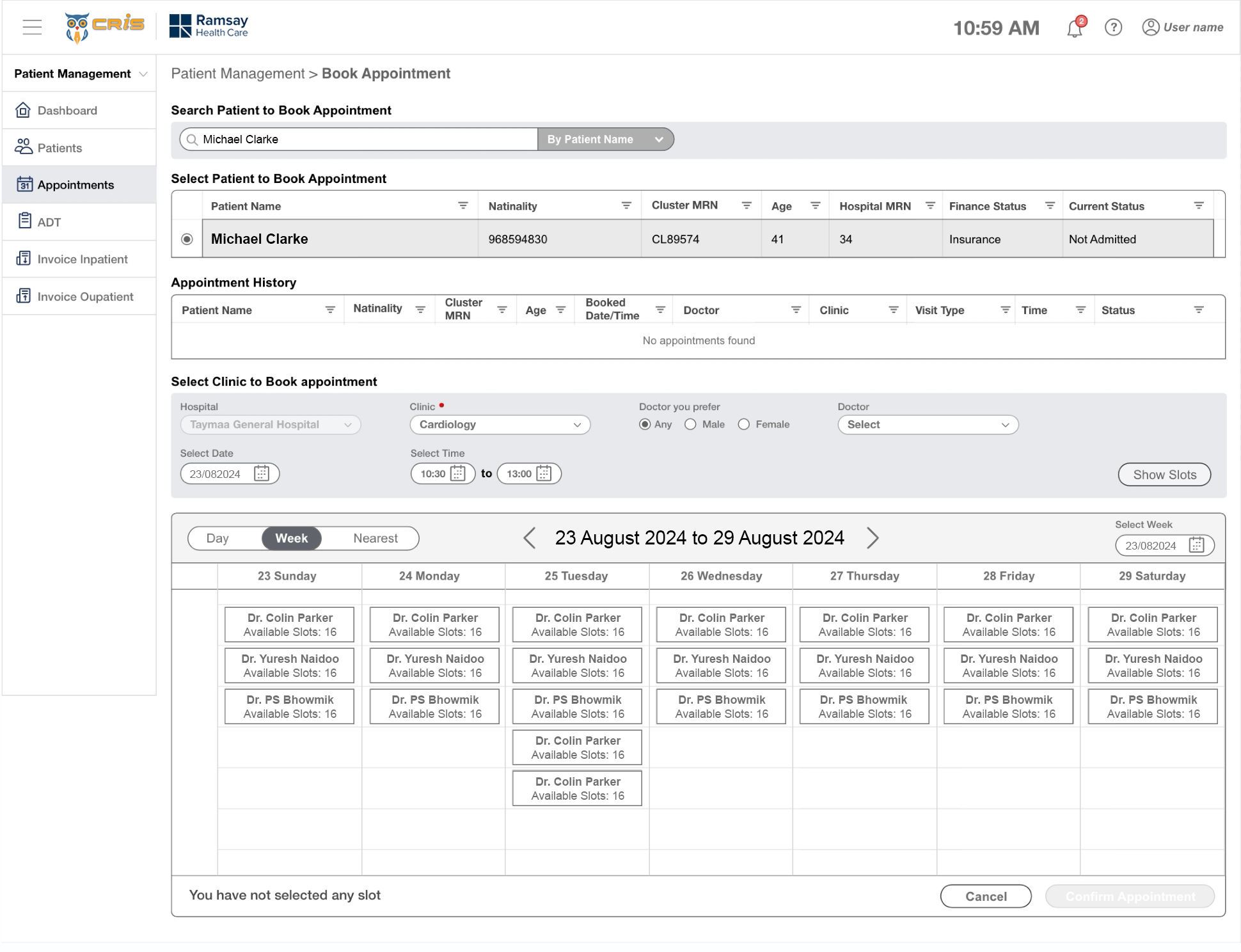
HIGH FIDELITY DESIGN’S
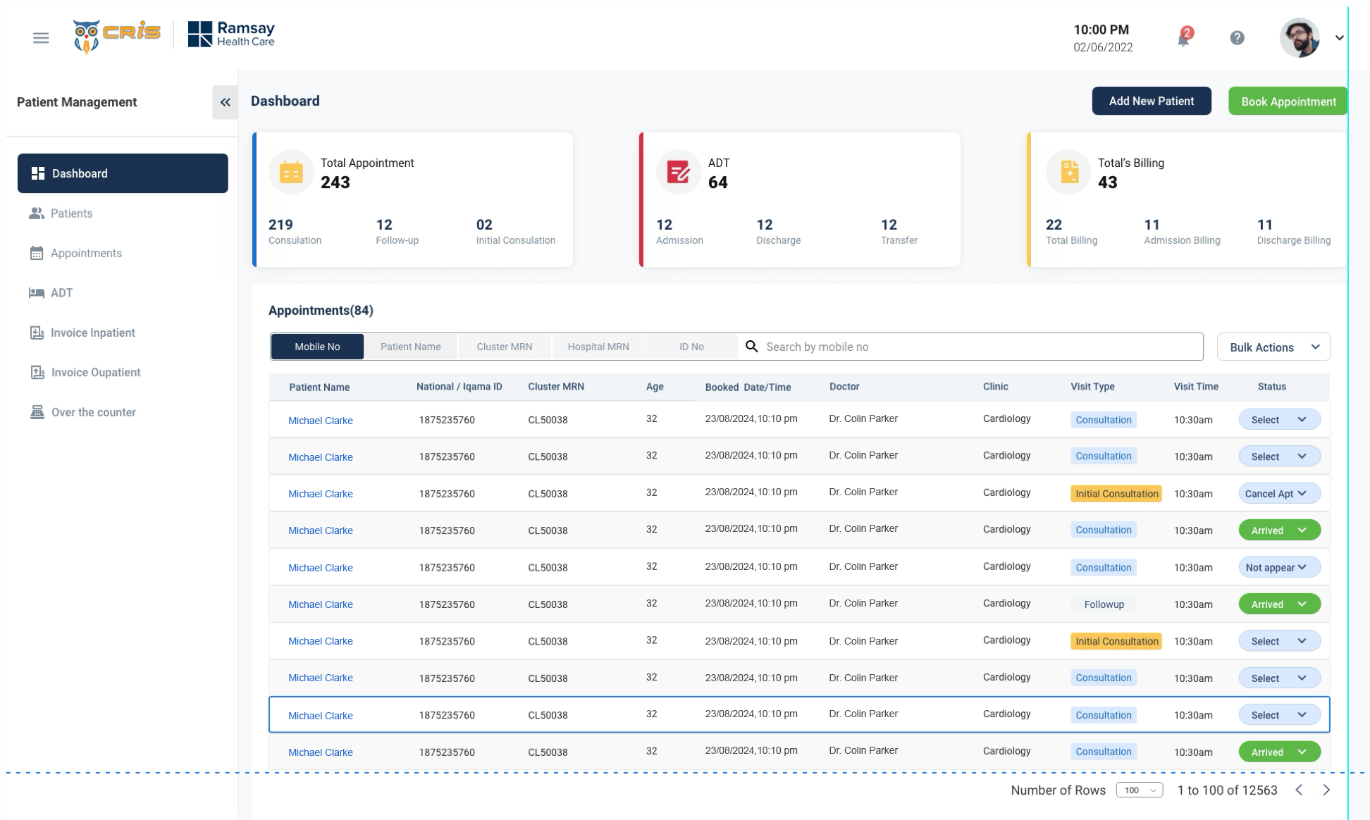
1. Receptionist Dashboard
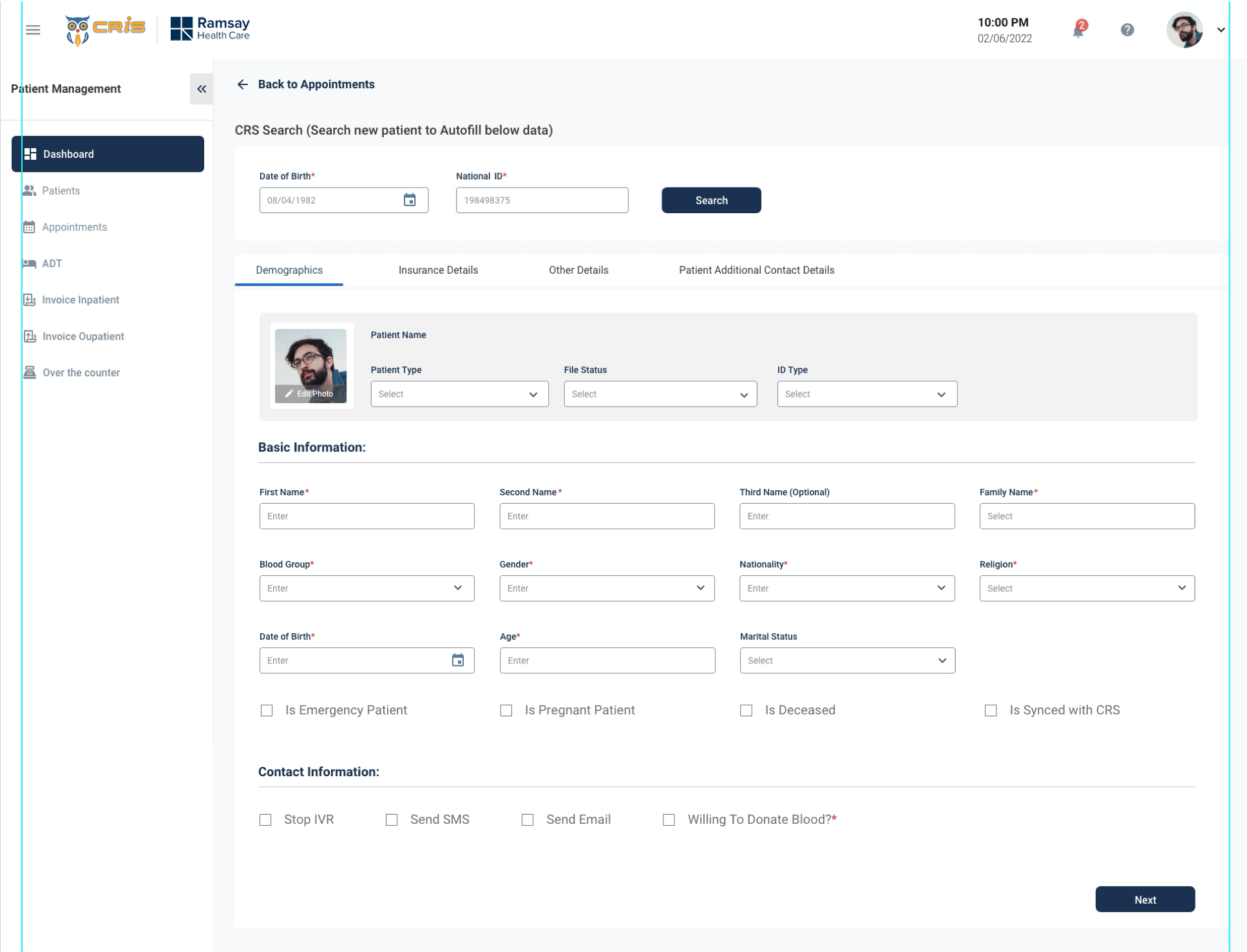
2. Patient Form
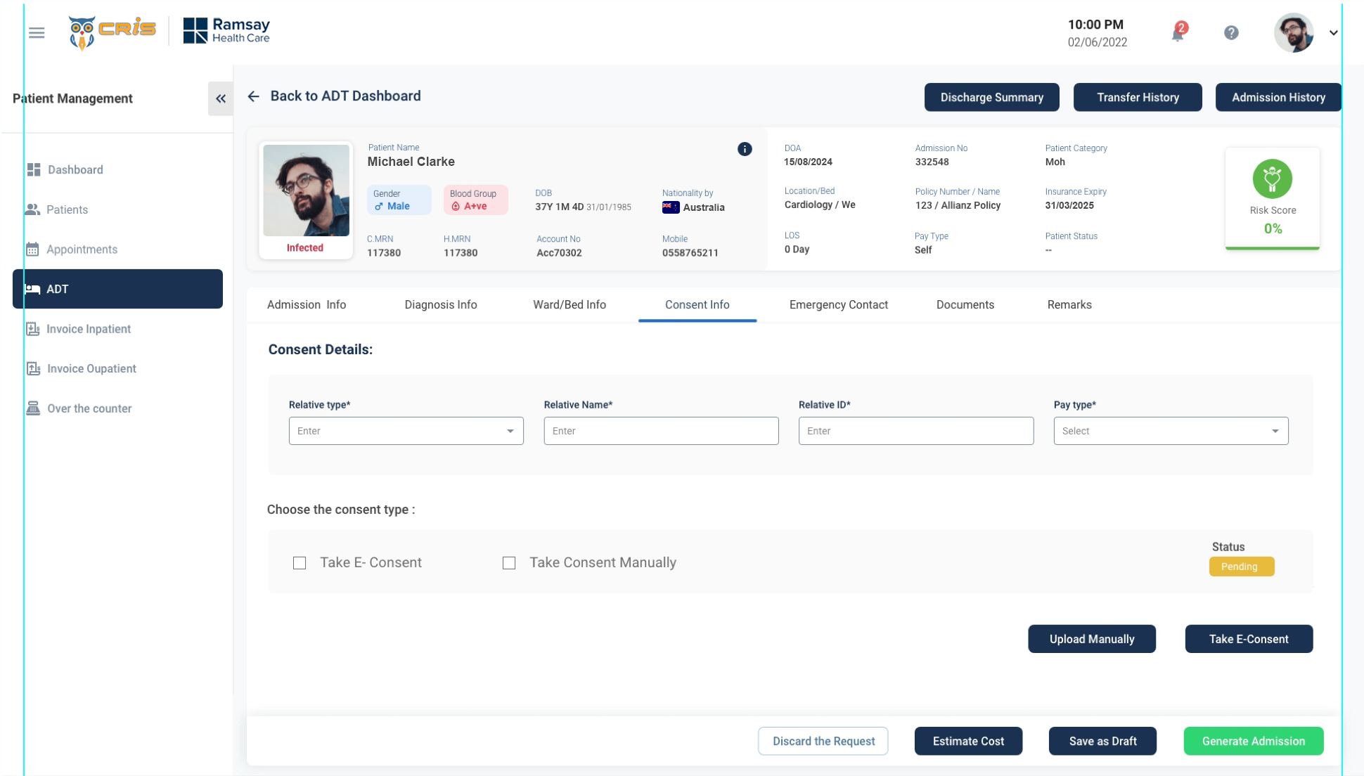
3. Patient ADT
DESIGN COMPARATIVE
1. ADT Dashboard (Before)
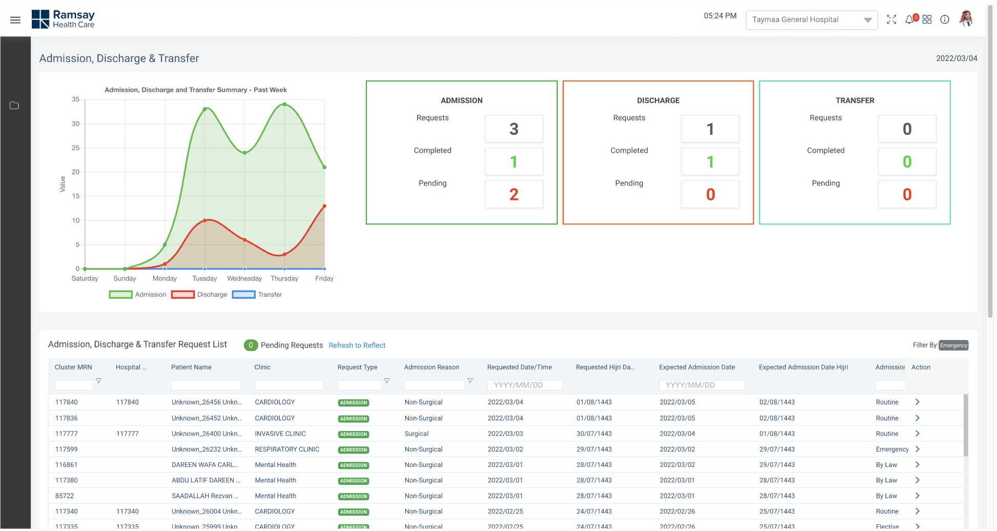
1. ADT Dashboard (After)
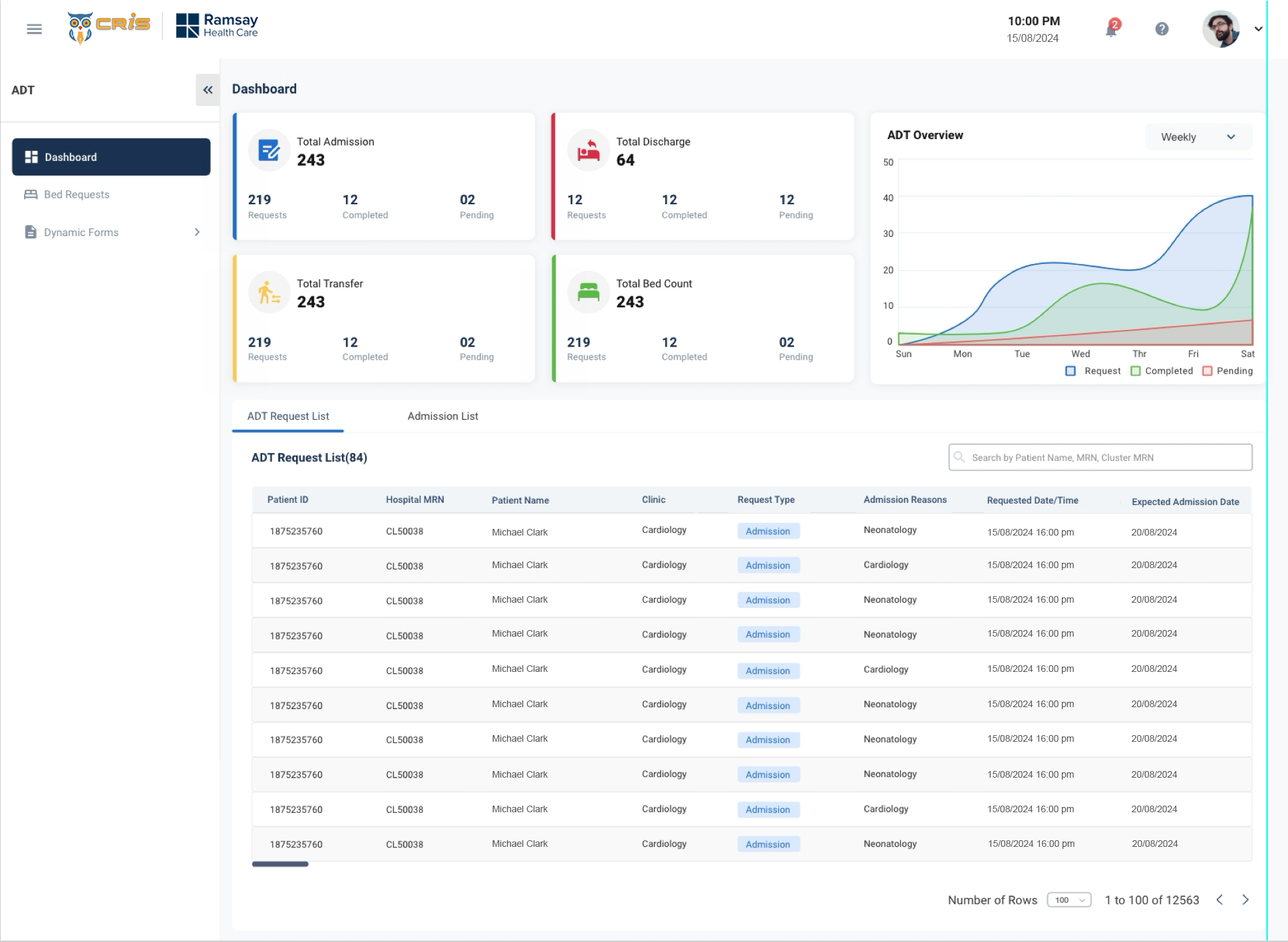
- We re-organised the entire dashboard based on user priority
- We redesigned the entire table.
- We worked on Ul part to make the application more
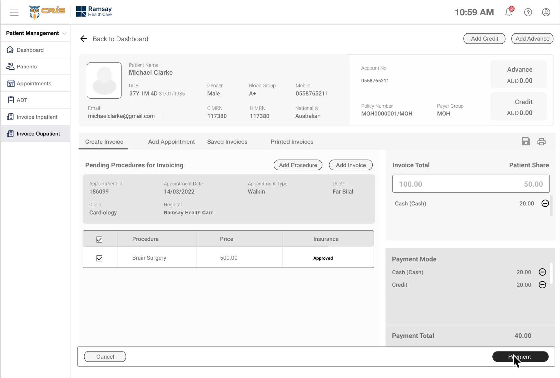
Patient Payment Details (Before)
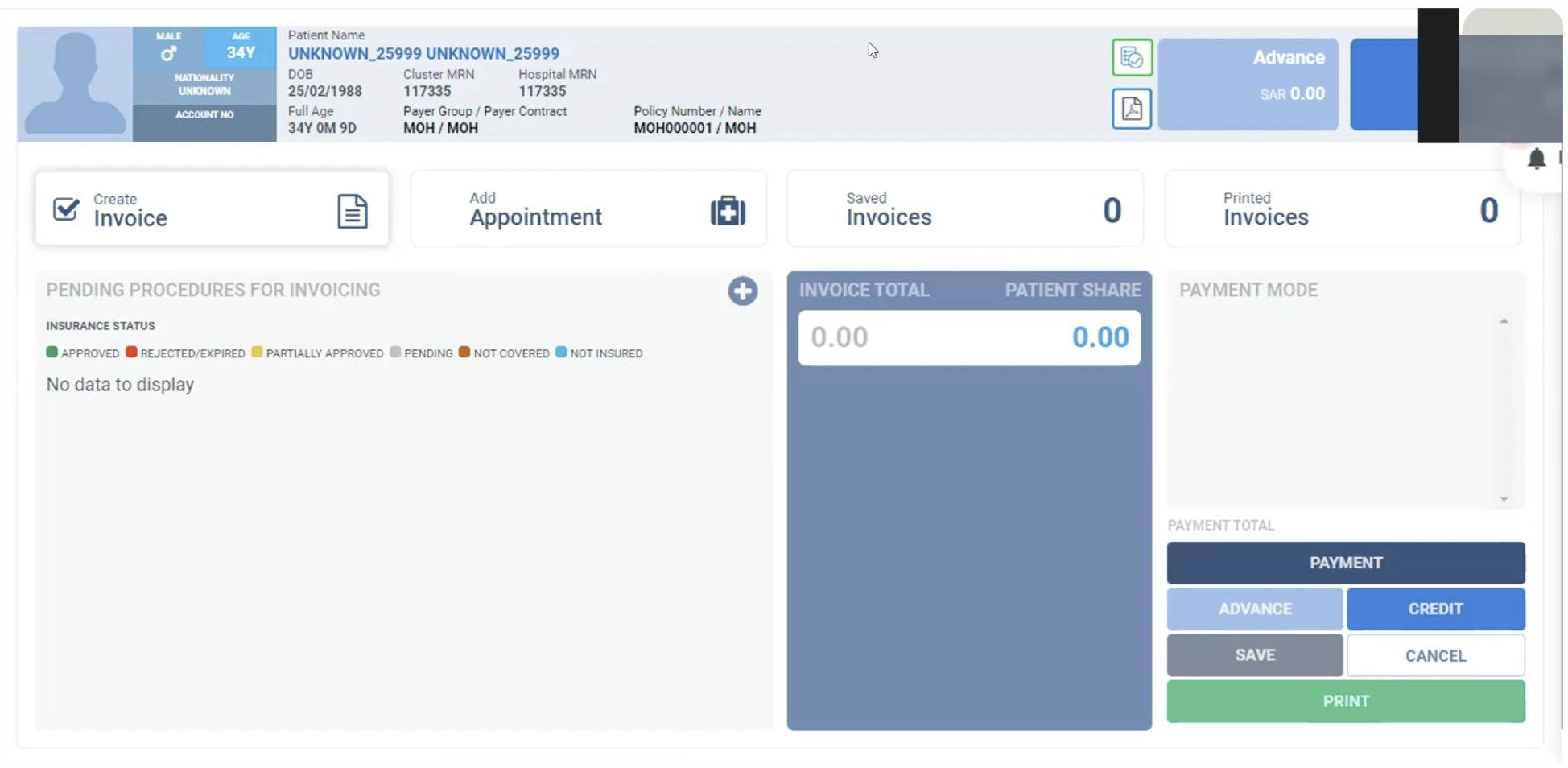
Patient Payment Details (After)
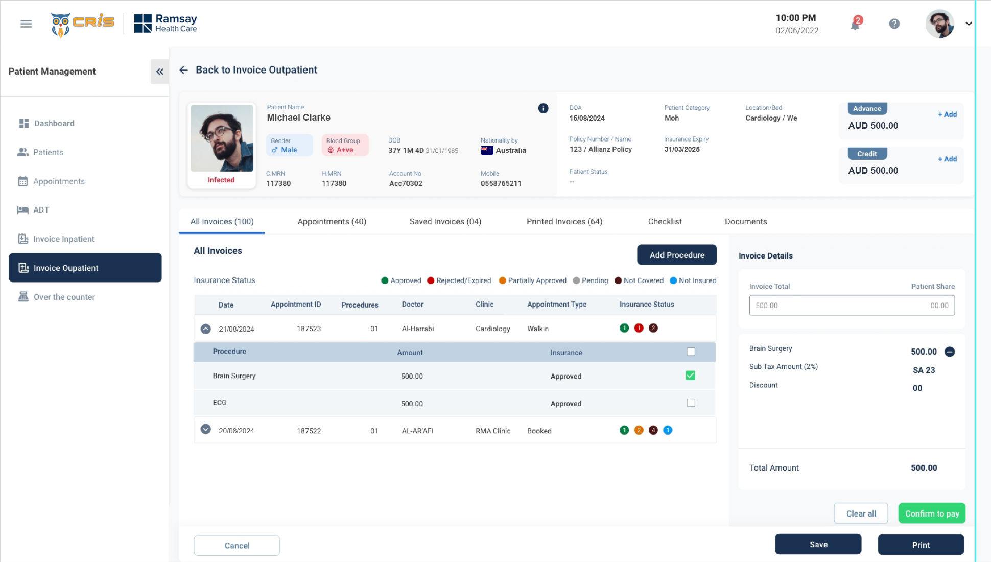
- We re-organised the entire screen based on user priority
- Too many button will confuse the user. So we reduced the button.
- We worked on layout(3 layout into 2 layout) .
- We worked on Patients details based on the
Patient Detail Screen (Before)
Patient Detail Screen (After)
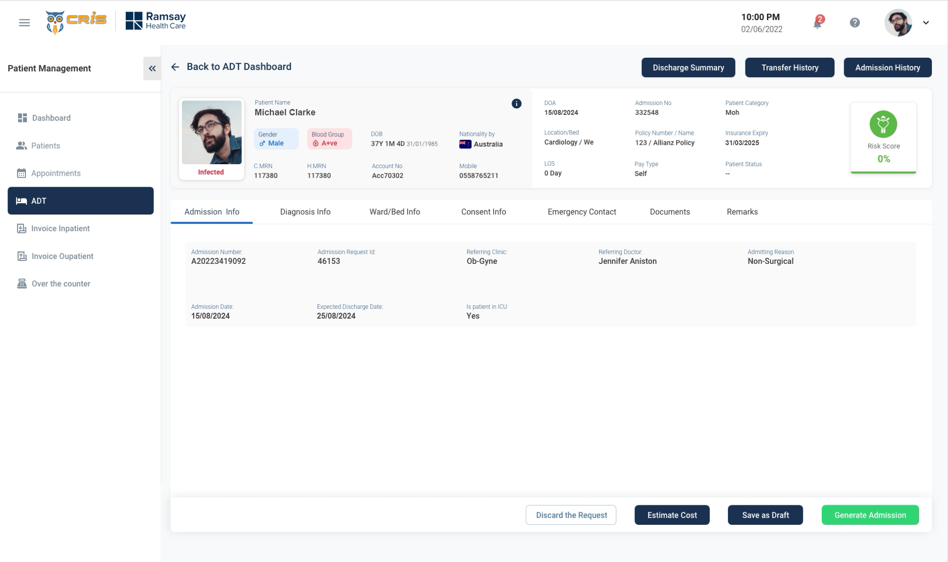
- We re-design the entire screen to make it more simple and easy to navigate.
- Too much vertical scroll reduced by providing tab view.
- Risk Score has placed in right side of the screen to get users attention.
- We grouped the information of users and placed it under each tab to make it more simple.
USABILITY TESTING
Method Used: Moderated Remote Testing (Zoom Calls)
- Total Users participated – 9/10
- Reception/Front Desk-4
- Medical Directors – 2
- Finance team – 3
- Dashboard Efficiency ?
- Invoice Process improvement.
- Productivity in Patient Management.
- Efficient Reporting to the Leadership
Usability Measures (on a scale of 1-7)
- Intuitiveness – 6
- Ease of Use – 6
- Visual Design – 7
- Productivity – 6
- Overall Satisfaction -6
Additional Feedback received
- Dashboard needs some more reporting KPI’s
- Ul looks much fresh and vibrant, when compared to the previous Ul.
- Can we have personalised screens like the dashboard, based on roles?
- Invoice team do not need a lot of information around the patient.
- What are the opportunities of automation?